Missouri: The St. Louis Compton Hill Water Tower
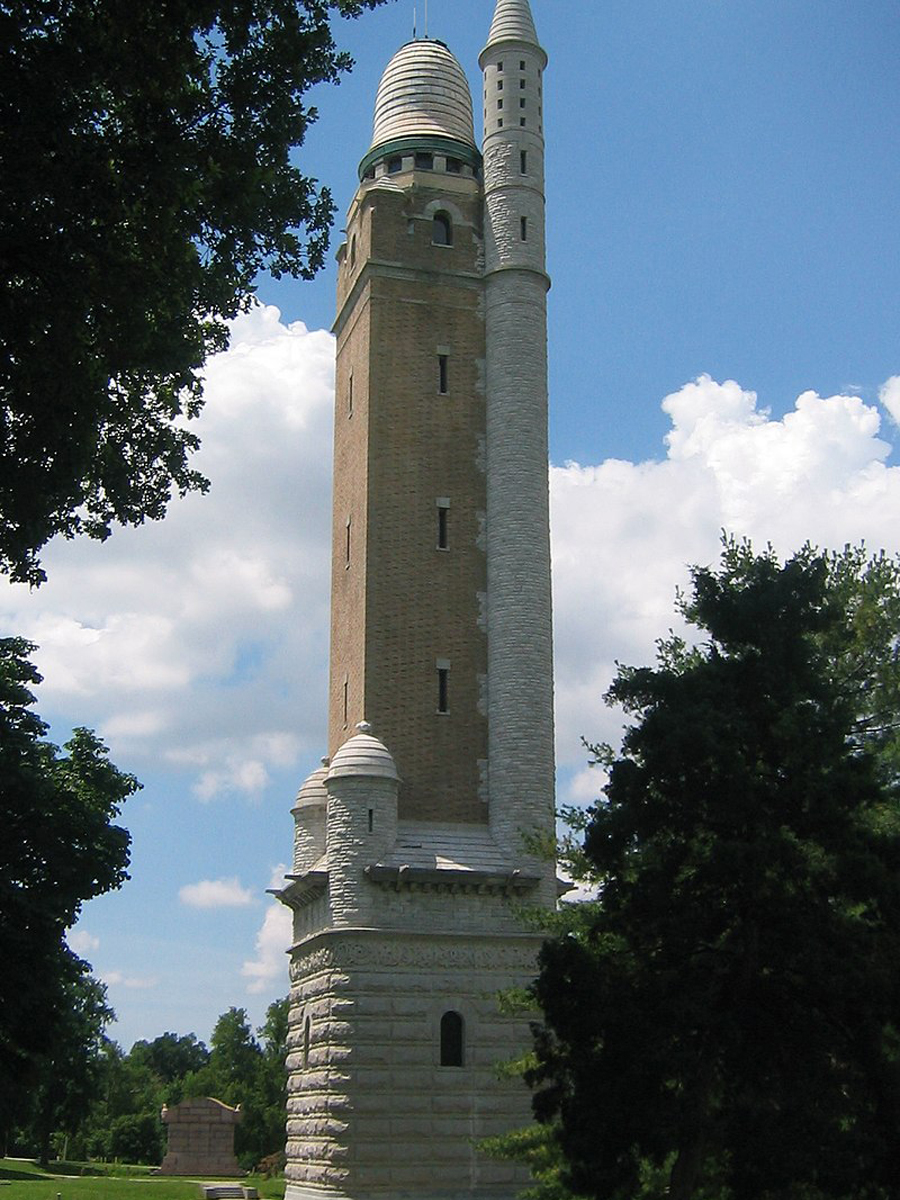
Did they run out of the original building supplies for this? Was there a fight about what this tower should look like? This mish-mash building is an eyesore, but it’s also a functioning water tower, so we guess it can stay...for now.
However, the unusual towers aren't actually the most controversial things about this property. That honor goes to a scandalous sculpture near the water tower that was gifted to St. Louis by the German-American Alliance in 1914. One donor managed to convince the artist to make the sculpture out of bronze instead of marble in the hopes that it would make the artwork look a little less indecent.
Louisiana: Old State Capitol Building in Baton Rouge
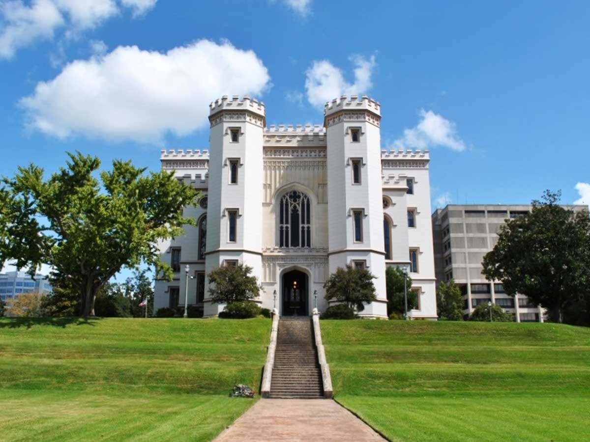
There’s nothing wrong with a good castle here and there, but this thing really sticks out in the Louisiana bayou. Let’s hope it sinks into a swamp.
The construction of the building took almost a decade in the middle of the 19th century, and it served as Louisiana's capitol until the 1930s. After being retired from service, the castle was renovated and restored in the 1990s as a museum of political history.
Colorado: Denver Art Museum
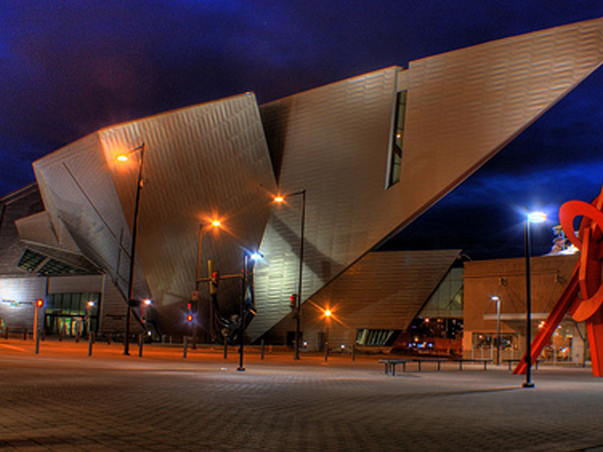
This design doesn’t scream “art museum” as much as it screams “supervillain’s lair.” The odd angles and sharp points are probably the furthest away from beautiful art that you can get.
Why is it that art museums are frequently designed to look like the most unappealing, unartistic buildings possible? Do with this quote from the designer what you will: "The project is not designed as a standalone building but as part of a composition of public spaces, monuments and gateways in this developing part of the city, contributing to the synergy amongst neighbors large and intimate."
Tennessee: The AT&T Building in Nashville
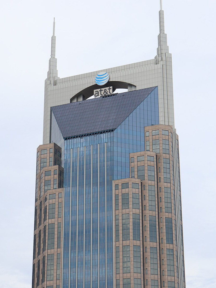
If any building on this list is a supervillain’s lair, it’s the AT&T building in Nashville. The thing has horns for crying out loud!
Before AT&T, the building was home to other communications companies and was originally completed in 1994. Currently, it's the reigning champion as the tallest building within the state, and locals lovingly refer to this monstrosity as "the Batman building." I think they're giving this building more credit than it deserves.
North Dakota: State Capitol Building in Bismarck
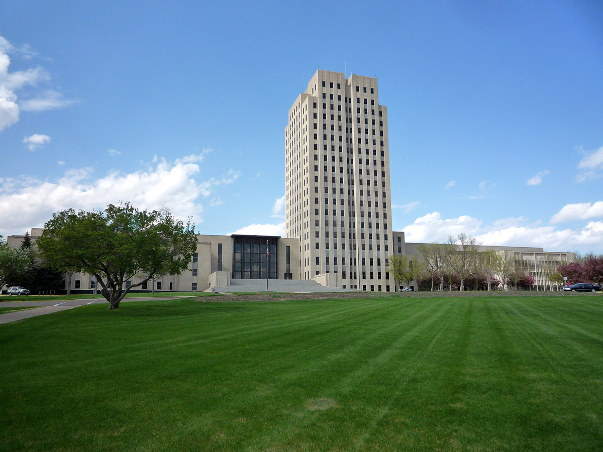
This building is allegedly done in the classic Art Deco style, but it’s the most depressing example of it we’ve ever seen. If this was in the middle of NYC you might not give it a second thought, but it definitely stands out in a bad way in North Dakota.
The capitol building is one of the tallest buildings in the state, which is probably how it got its nickname, "Skyscraper of the Prairie." The tower was designed by local North Dakota architects W.F. Kurke and Joseph Bell DeRemer, and construction was completed in the early 1930s.
Oregon: The Portland Building in Portland
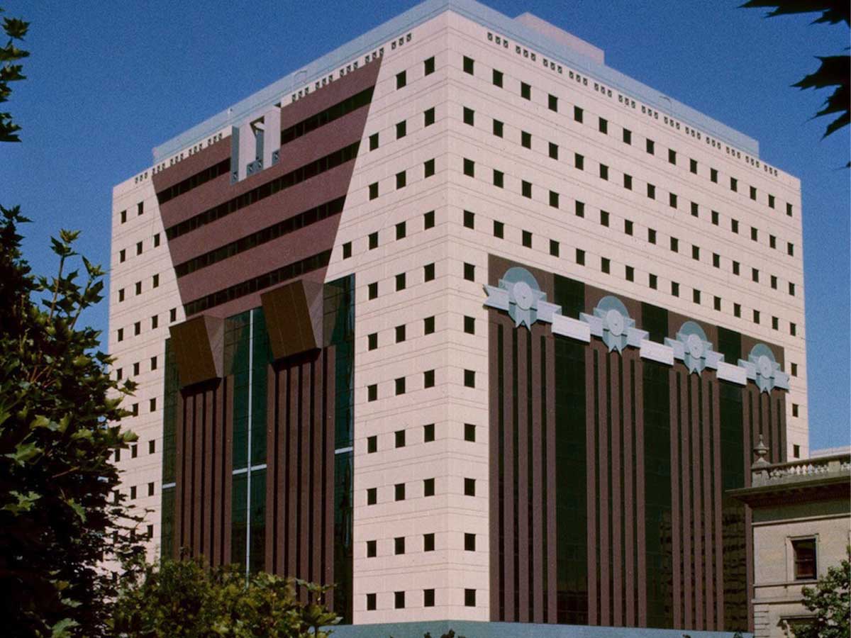
The Portland Building got to the Art Deco party a few decades too late. Although it looks like this building is straight out of the 1920s, it was actually completed in the '80s.
Within this anachronistic building, you'll find offices for the City of Portland, which is surprisingly boring for a structure this busy looking. Despite all the naysayers, when the building first opened it won architecture awards, which may mean that architects don't actually have a sense of style.
Kentucky: The Kaden Tower in Louisville
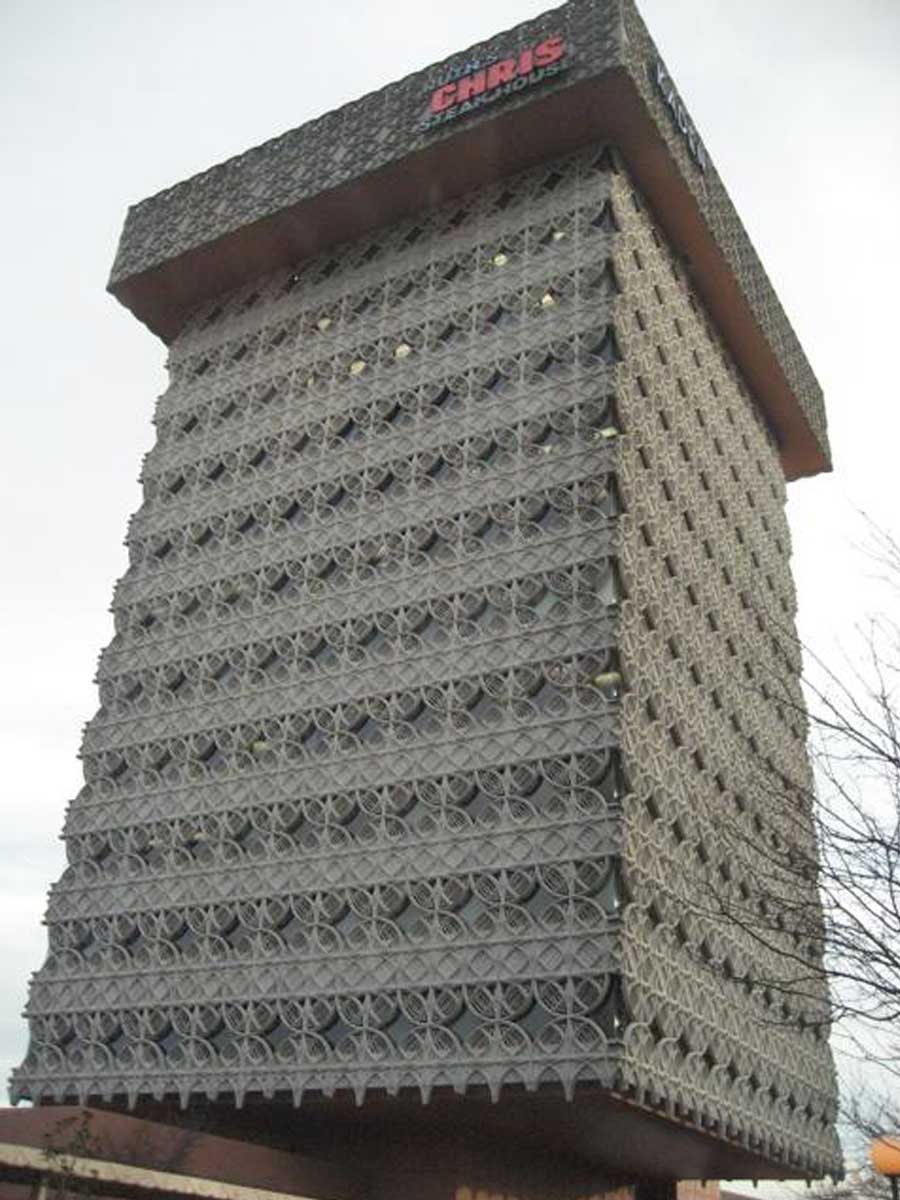
The Kaden Tower in Louisville was apparently designed by a student of the famous architect Frank Lloyd Wright. It seems like the guy could have used a few more lessons before he tried his hand at designing this building.
The building originally opened in 1966, and while it looks like the whole thing is covered in barbed wire, the official term for the design is "cantilevered structure with a suspended lacework facade." In addition to the weird look, it's also home to a weird combination of tenants--the bottom floors are offices, while there's a Ruth Chris Steakhouse on the top floor.
Michigan: The MotorCity Casino and Hotel in Detroit
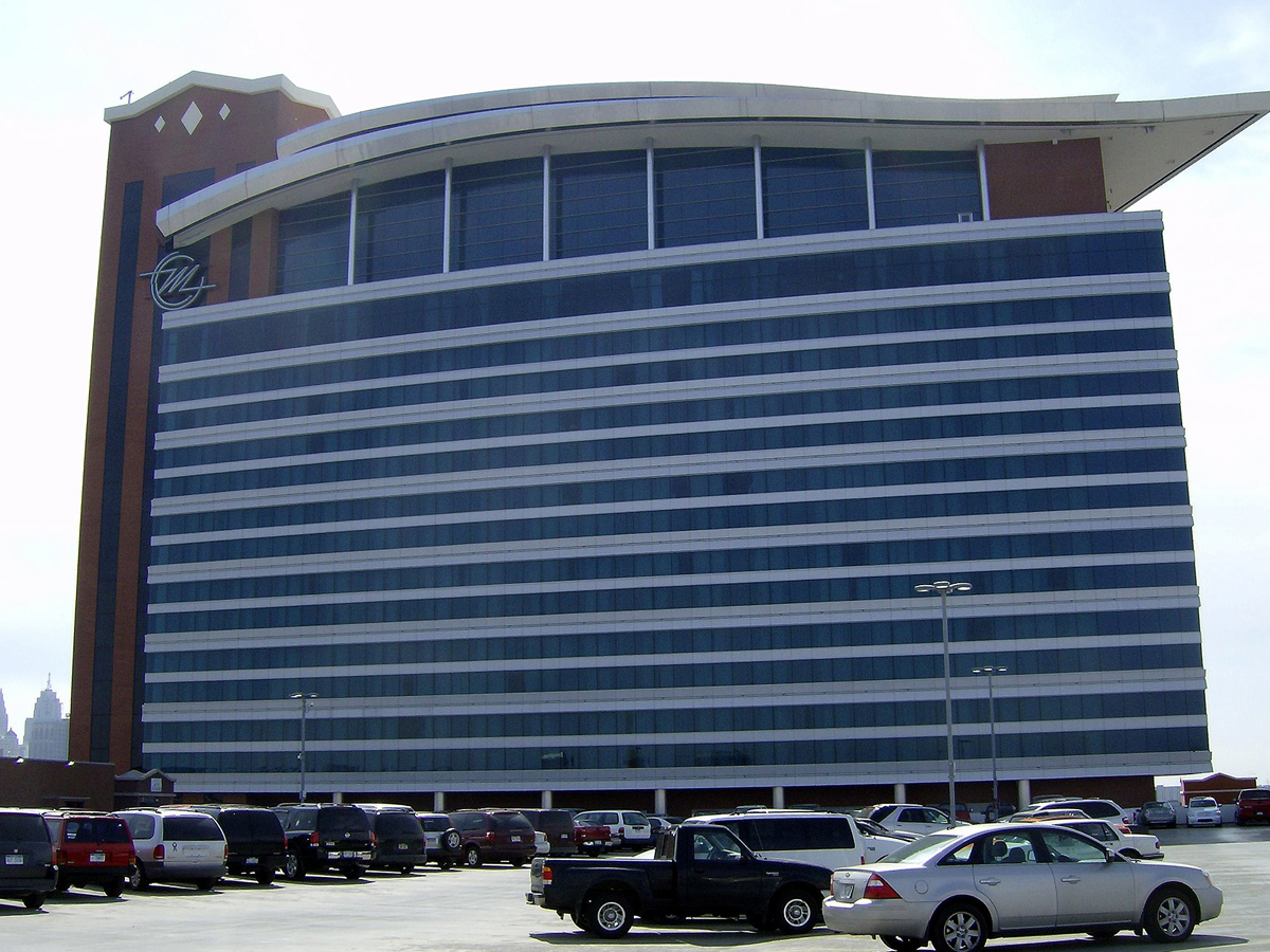
If this building were in Las Vegas, it would fit right in. Unfortunately, it’s in Detroit. Casinos are already depressing, but this design just makes this one more so.
The building might stand out from an architecture standpoint, but, surprisingly, it's not the only casino in Detroit--the city actually boasts four of them, despite their relative rarity in urban settings. The curved roof is supposed to be reminiscent of a car, but it just looks like a slick hairstyle to me.
South Dakota: The Qwest Tower in Sioux Falls
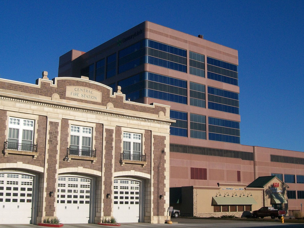
The CenturyLink Tower (formerly Qwest) may be the ugliest building in South Dakota, but that’s not it’s only claim to fame. At a “gargantuan” 11 stories, it’s also the tallest building in the state.
The building was originally completed in 1962, but it looked quite a bit different than it does today. Originally, the tower had a facade of white stone, but, because of structural issues, this all had to come down. It was only then that the current exterior was installed. Additionally, one portion of the building was demolished to make room for more parking in 2011.
Georgia: The Mercedes-Benz Stadium in Atlanta
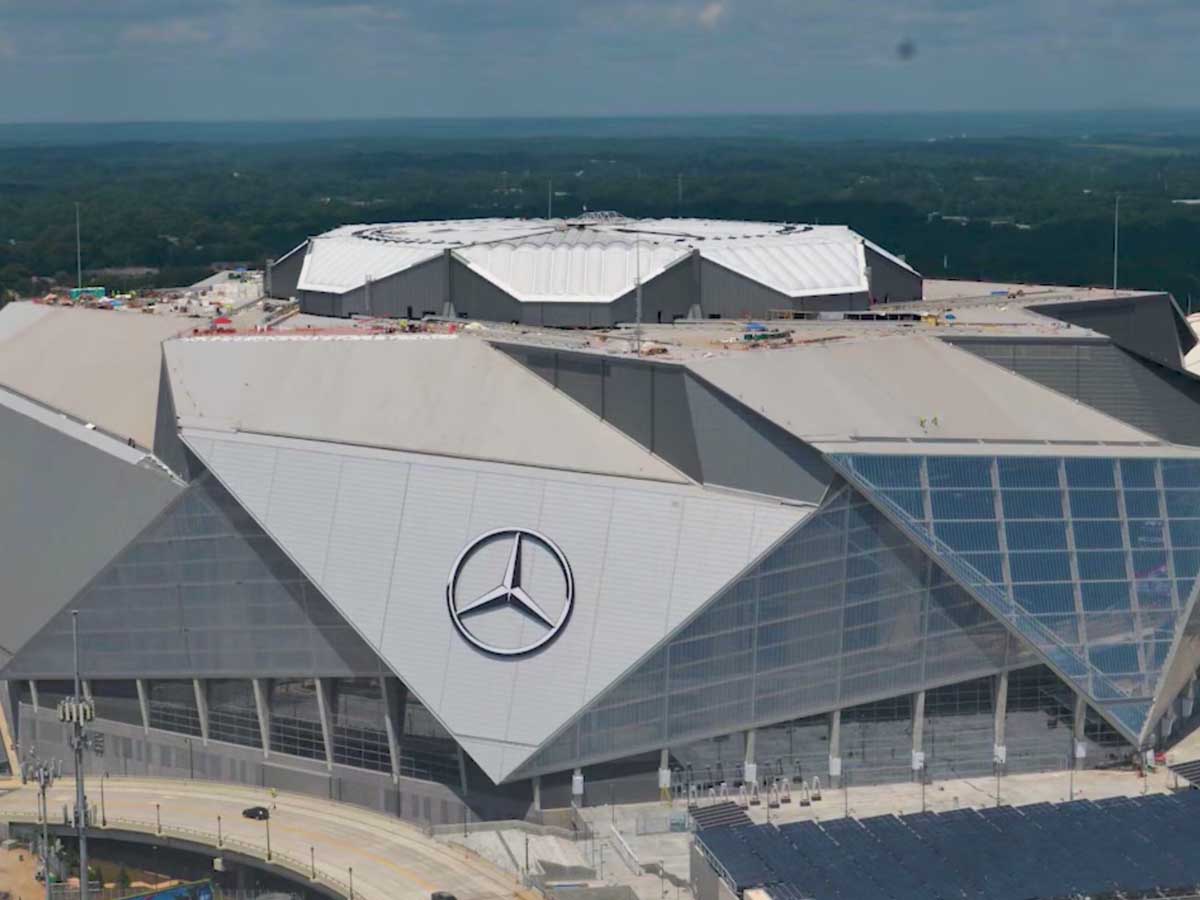
Why are pointy, angular buildings so popular? I don’t want to even look at this thing, much less go inside and watch the Falcons play.
The stadium officially opened in August of 2017 and acted as a replacement for the Georgia Dome, which itself had only been around since the 1990s. The unusual roof is retractable, which might help to explain why it looks so strange, but that doesn't make it any easier to look at.
New York: 432 Park Avenue
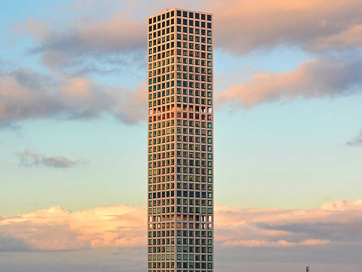
432 Park Avenue is one of the tallest residential buildings in the world. Unfortunately, it’s also one of the ugliest. The tower was completed in 2015, but its design makes it look like the whole thing is still covered in scaffolding.
It should come as no surprise that this eyesore is home to some of the most expensive condos in all of New York City, and the building even boasts private restaurants that are only available to residents. I don't get the appeal, though--you couldn't pay me to live in this place!
Alabama: The Government Plaza in Mobile
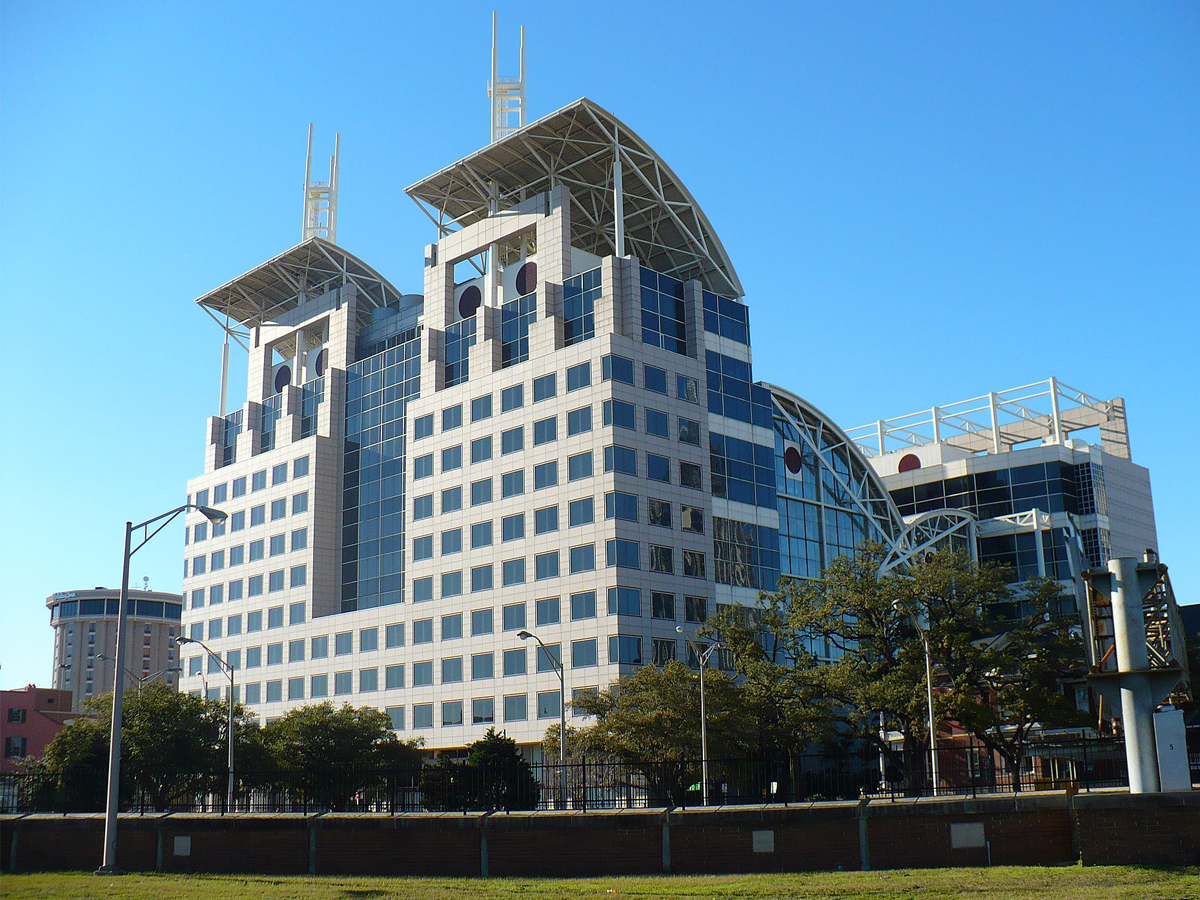
This building very much looks like a high-tech prison you’d find in a dystopian sci-fi movie set in 2050. But the city government building for Mobile, Alabama? I don’t see the resemblance.
The plaza was originally known as the City-County Administration building, but it was renamed in 2013 in honor of the outgoing mayor of Mobile, Samuel L. Jones. All that glass turned out to be not a great idea, because the building has struggled with leaks during heavy rain since its construction.
Arkansas: John Paul Hammerschmidt Federal Building in Fayetteville
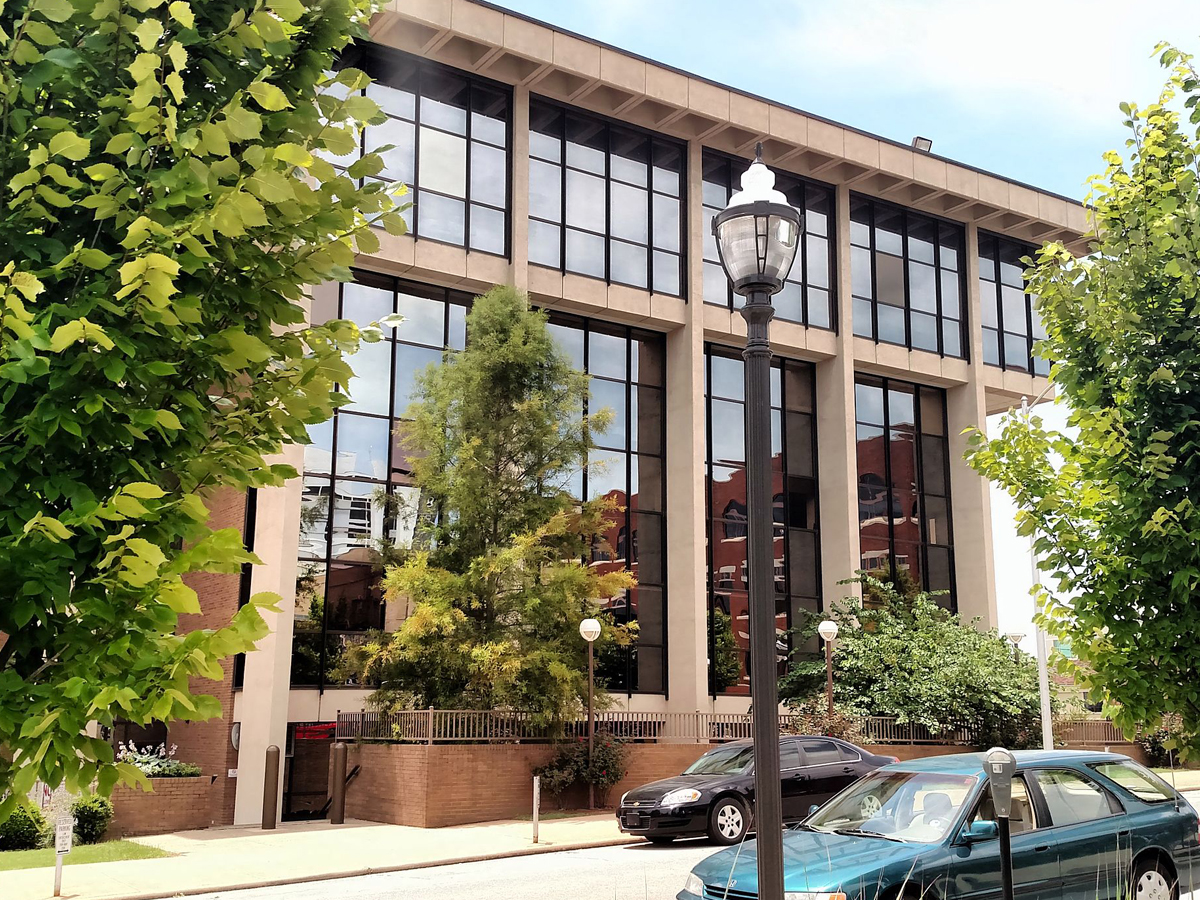
In a town known for its beauty, the John Paul Hammerschmidt Building in Fayetteville, AR sticks out like a sore thumb. It would probably be a step up if this thing were dreadfully ugly and not just dull beyond belief.
The building is home to the US District Court for western Arkansas, and it's located near the historic district in Fayetteville. It was named after Arkansas politician John Paul Hammerschmidt, who served for 13 terms in the US House of Representatives.
Massachusetts: Boston City Hall
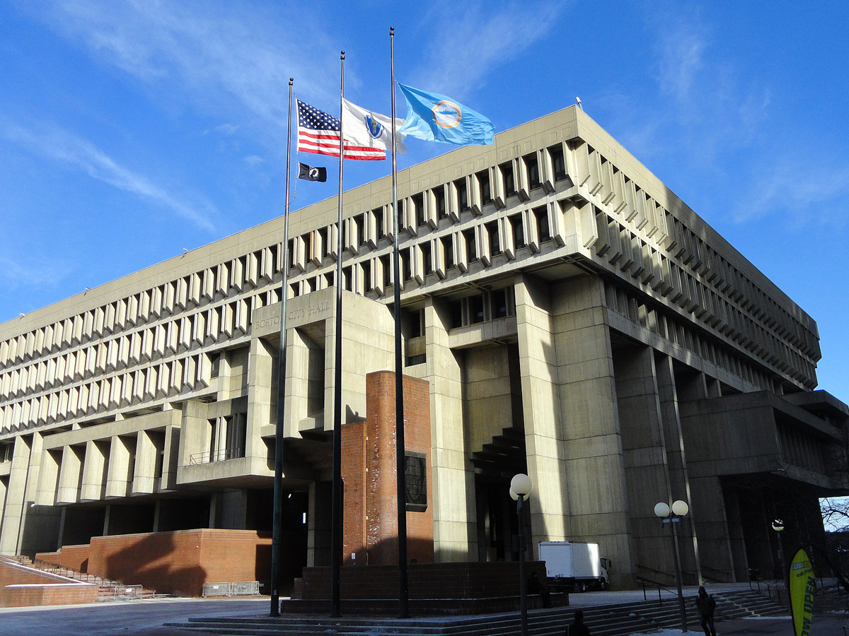
Surely an iconic American city like Boston deserves a better city hall than this? I wouldn’t want to step foot in this one unless I had to, and then I’d probably be lost forever in this labyrinthine, stone maze.
The Boston City Hall building was constructed in 1968, and it, like so many other buildings of the time, fell victim to one of architecture's ugliest trends--brutalism. City hall is already not a place that most people are thrilled to visit, but things are made even worse by what an eyesore the actual building is.
New Jersey: American Dream Meadowlands Mall in East Rutherford
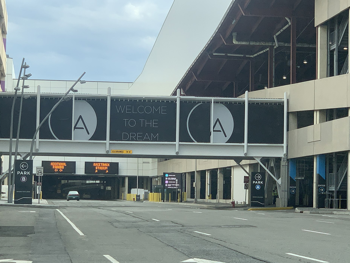
This mall isn’t as much of an American dream as it is an American nightmare. The whole thing is blindingly white on the outside and inside, which might actually be a good thing--you can’t see how ugly this building is if you’re blind.
Plans for the mall began all the way back in 2003, but it was 2019 before anything in the building actually opened thanks in large part to problems with financing the construction. Unfortunately, they pretty quickly had to close up shop again in 2020 thanks to the coronavirus pandemic.
Nebraska: Omaha Police Department HQ

Hey, just because it’s a police building doesn’t mean it has to look like the world’s most depressing prison on the outside. This stone box is the worst that Nebraska has to offer.
The building was completed in the 1970s, and, terrifyingly, apparently contained a lot of asbestos. Its had some renovations over the years to improve the safety of the inside, but one thing that's remained constant is it's dreadfully ugly exterior.
Illinois: The Thompson Center in Chicago
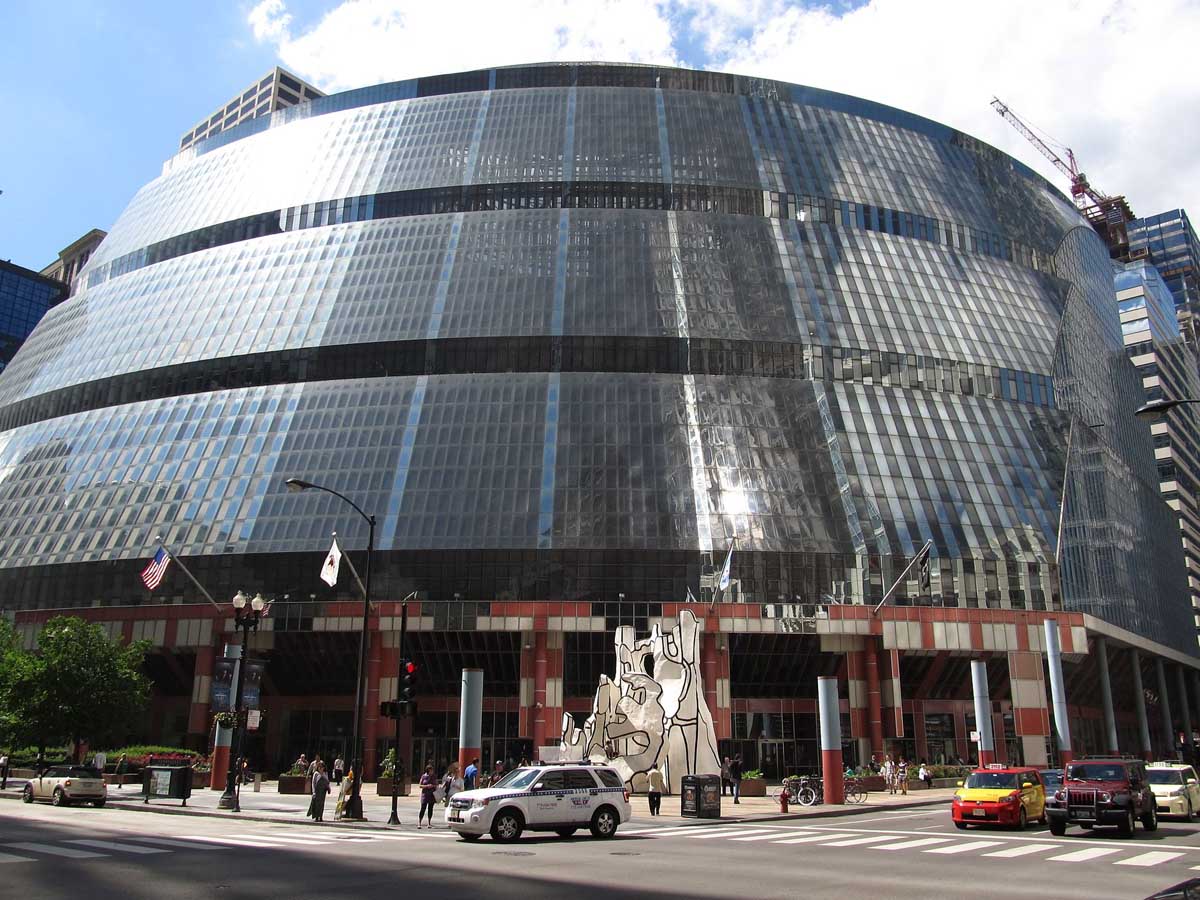
The Thompson Center is allegedly a government building, but it looks like it could double as a UFO. I don’t think anyone would be upset if this thing blasted off into space and was never seen again.
The design of the building has posed problems over the years in terms of temperature control. Because the glass used wasn't insulated, the building really heats up in the summer and gets freezing in the winter. Recorded temperatures within the center have been as high as 90 degrees!
North Carolina: The Biltmore Building in Asheville
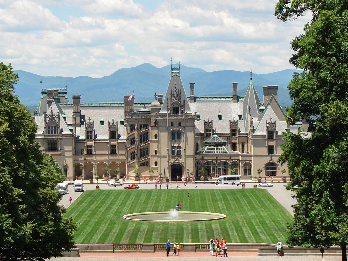
The Biltmore Estate is not hideous in and of itself, but it makes absolutely no sense within the context of North Carolina. This castle seems like it would be more at home in the Old Country as opposed to the Old South.
The Biltmore Estate is the largest privately owned home in the entire country, and it belongs to the historic Vanderbilt family. That shouldn't really come as a surprise to anyone, because it's clear from looking at it that it was designed by someone who had more money than sense.
New Mexico: University of New Mexico’s Humanities Building
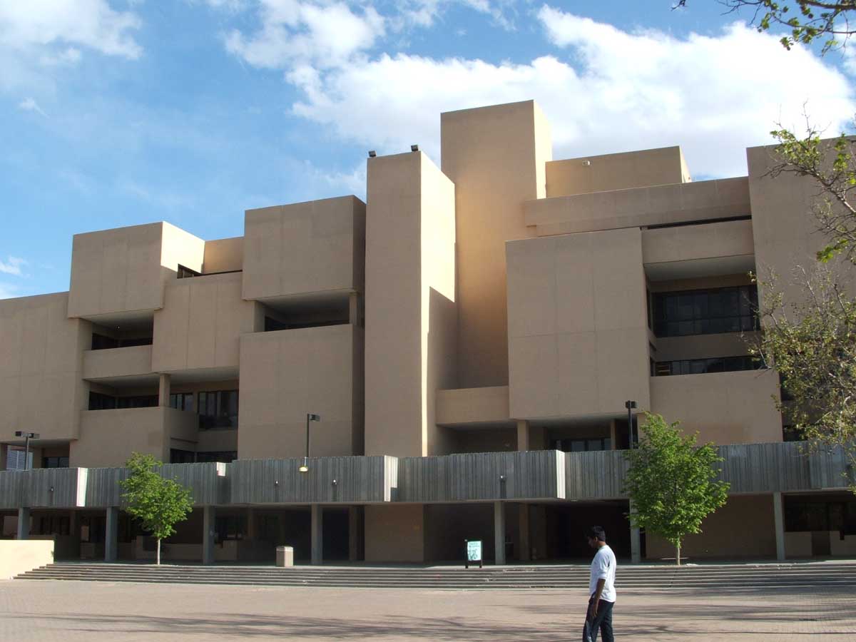
This building looks like the worst brick-laying job we’ve ever seen. And considering how the windows are arranged, it seems like the designer was actively trying to prevent natural light from reaching those inside.
The building officially opened for business in 1974, and interestingly enough, it's not the most infamous building the architects behind it ever designed. That distinction goes to their design work for the laboratory where the first atomic bombs were tested in Los Alamos. Although it may be ugly to look at, at least this building won't give you radiation poisoning.
Arizona: The City Hall of Tempe
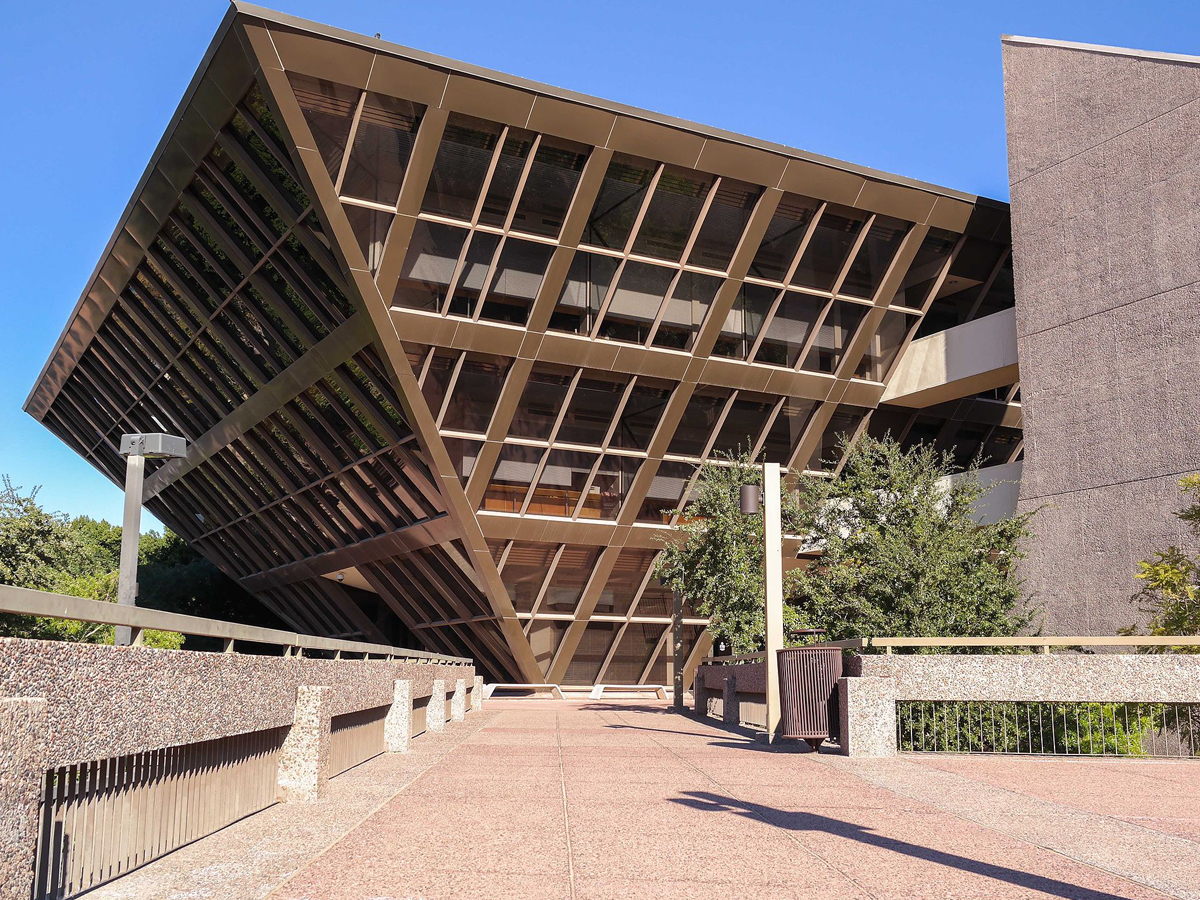
Municipal buildings don’t necessarily need to be sporting the most beautiful architecture known to man, but this is just ridiculous. Let’s leave the pyramid making to the ancient Egyptians--they at least had sense enough to build them right-side up.
The building was completed between 1969 and 1971 and was designed by Arizona natives Kemper Goodwin and Michael Goodwin. The city of Tempe had already rejected two of the architects' designs before they unveiled their idea for an upside down pyramid--leaving us to wonder just how terrible the other ideas were if this was the one that eventually won out.
Connecticut: The Pirelli Building in New Haven

I can’t help but feel like this building was designed upside down. That being said, it still wouldn’t look great even if they were to flip it over.
This confused building was first completed in 1970 and was originally home to the Armstrong Rubber Company. In 2003, IKEA purchased the building but left it unused for years, much to the chagrin of the structure's misguided fans. However, they recently announced their plans to turn it into a hotel and conference center.
Maryland: Morris A. Mechanic Theatre in Baltimore
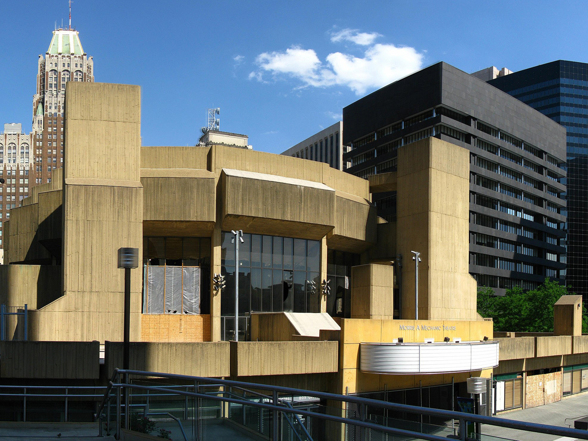
Why do strange shapes and drab concrete appear together so often in architecture? One or the other would be bad enough, but you can see for yourself how terrible they are when combined.
Unfortunately, the Morris A. Mechanic Theater met its end when it was demolished in 2014. However, that was a full ten years after the theater itself had ceased operations, so it seems like it was overdue. No construction of a new building has taken place since it was torn down, meaning this property is still an eyesore!
Rhode Island: The Apex Building in Pawtucket
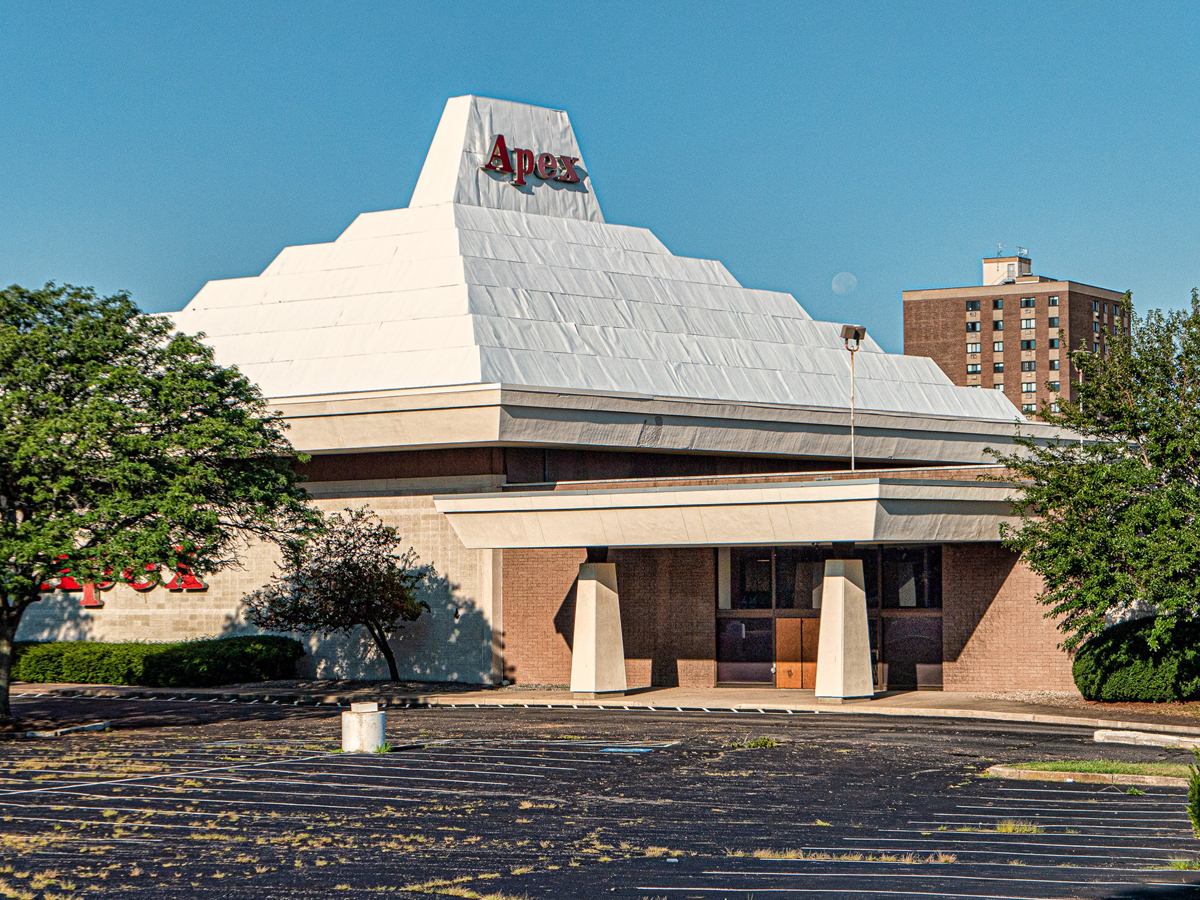
Despite what it looks like, this building is not a failed Pizza Hut. It may stand out in the surrounding area, but it’s definitely not in a good way.
The building was constructed in the 1960s to house the Apex Department Store, and it's unusual shape actually had a purpose--it was a workaround of the restrictive sign ordinances in the area. While there have been numerous plans to redevelop the building over the years, nothing has come to fruition yet.
Texas: Austin Courthouse
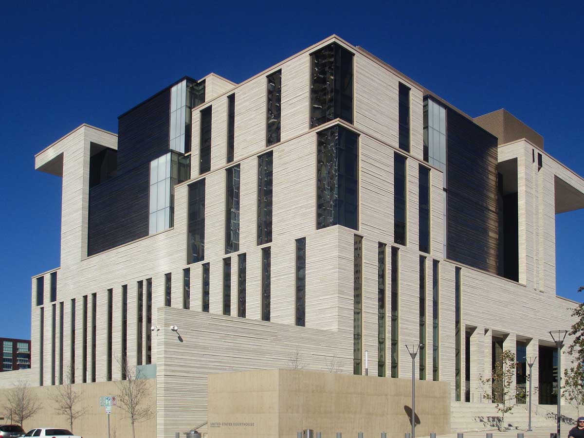
This building has a lot of different textures and materials going on. Unfortunately, none of them go together whatsoever. Everything is bigger in Texas--including their fails.
Construction on the building began in 2009, and it was completed by 2012, although we're sure that no one would have minded if this eyesore never opened. This was another building that was universally praised by architects while popular response was much more lukewarm.
Alaska: The Westmark Hotel in Anchorage
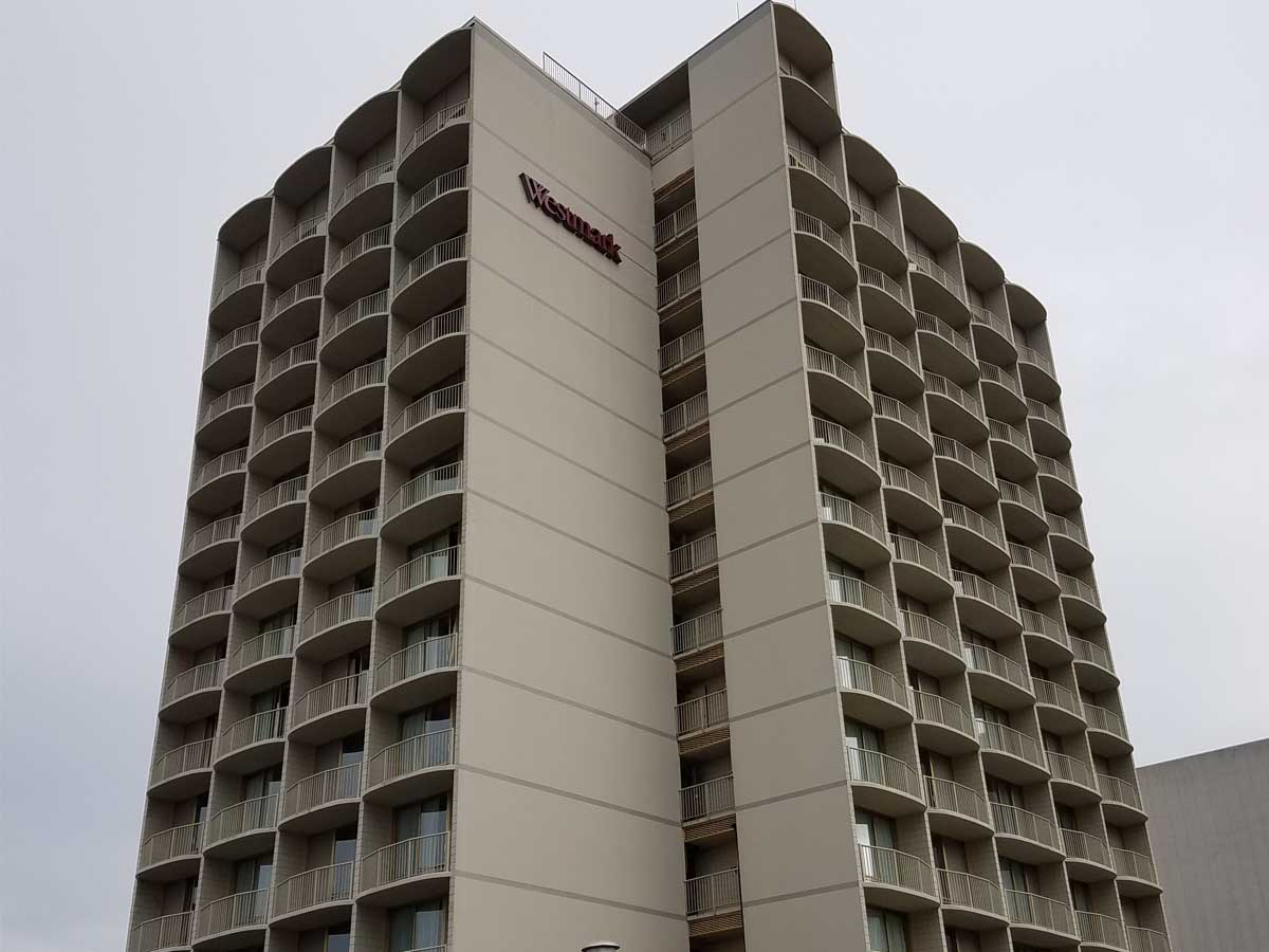
You might be in a hotel in Alaska when you stay at the Westmark in Anchorage, but this building will make you feel like a citizen of the Soviet Union!
Despite the drab exterior of this place, it managed to find some success among travelers, as its online reviews are solidly in the middle--which isn't great, but it's more than you would expect from just looking at the place. It's honestly in a decent location if you're looking to explore downtown Anchorage.
Wyoming: The Cheney Federal Building in Casper
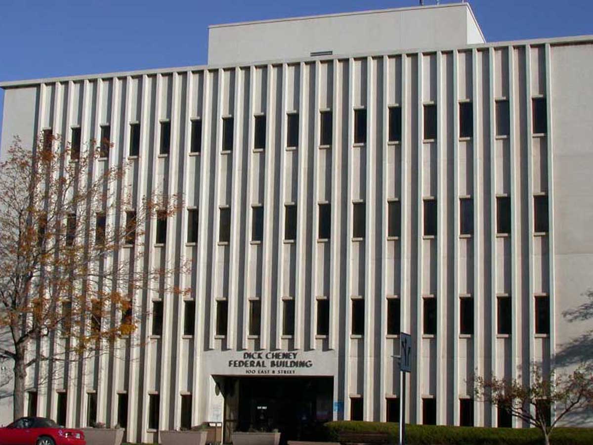
The federal government may not be good at much, but they’re true experts at designing the most depressing, drab buildings imaginable. Wyoming deserves better than this.
This federal center was named after former vice president Richard Bruce Cheney, who was also a state representative for Wyoming earlier in his political career. However, the building is actually much older than its name--it was originally constructed in 1970 Engstrom & Deines/J.T. Banner & Associates.
Indiana: Minton–Capehart Federal Building
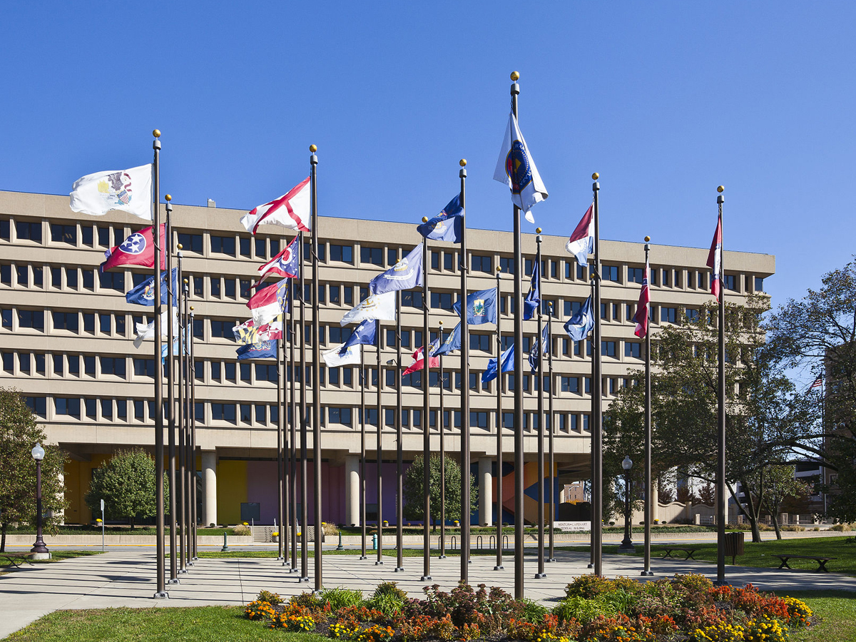
Why does it seem like people try to make government buildings as unappealing as possible? There’s actually a beautiful mural painted on the bottom level of the building (designed by the creator of the I <3 NY logo), but it’s overshadowed by the drab, upside down pyramid on top of it.
In addition to being called one of the ugliest buildings in the state, the Minton-Capehart Federal Building has also been referred to a "pigeon coop", which is a much more vivid description of this building's shortcomings. Although the building was designed by local architects, they used the brutalist style, which feels much more at home in the Soviet Union than Indiana.
Pennsylvania: Wesley W. Posvar Hall at the University of Pittsburgh
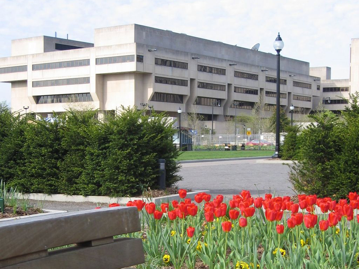
Why would a college make their living spaces look like giant, cement dungeons? Isn’t the whole point to make potential students excited to be there?
The Wesley W. Posvar Hall is the biggest building on campus, which is unfortunate, because it makes it extremely hard to miss. The building was completed in 1973 and was done in the brutalist style, which is never a good sign in terms of looks. However, this building hasn't gotten as much hate as some others on this list.
Maine: School of Law Building at the University of Maine in Portland
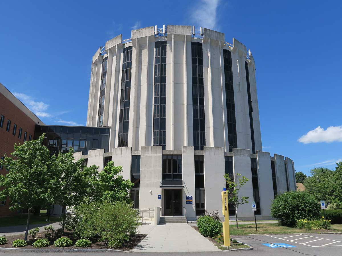
Will you learn to practice law in this building or will you be chained to the walls and left to rot in this Tower of London-looking monstrosity? I think your chances are 50/50.
The building was designed a Maine architect firm, Wadsworth, Boston, Dimick, Mercer and Weatherill, and was completed in 1972. It additionally received an expansion of the first floor in 1993. The building is considered to be in the brutalist style of architecture, which is definitely a rarity for Maine and New England in general.
Minnesota: The Frederick R. Weisman Art Museum in Minneapolis
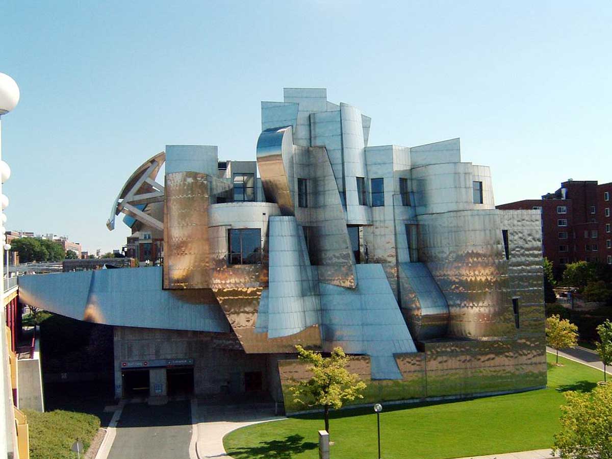
What is it with art museums being some of the ugliest buildings in existence? Considering what they house, you’d think they would go for, oh, I don’t know, a beautiful look. This aluminum foil monstrosity looks like something a five-year-old would design.
The building was designed by a world-famous architect, which is always a bad sign because they clearly can't be trusted to create beautiful buildings. However, credit where credit is due--this thing would be a nightmare to design with the aid of computers, but it was actually created before computer-aided design came to the world of architecture.
Nevada: Veer Towers in Las Vegas
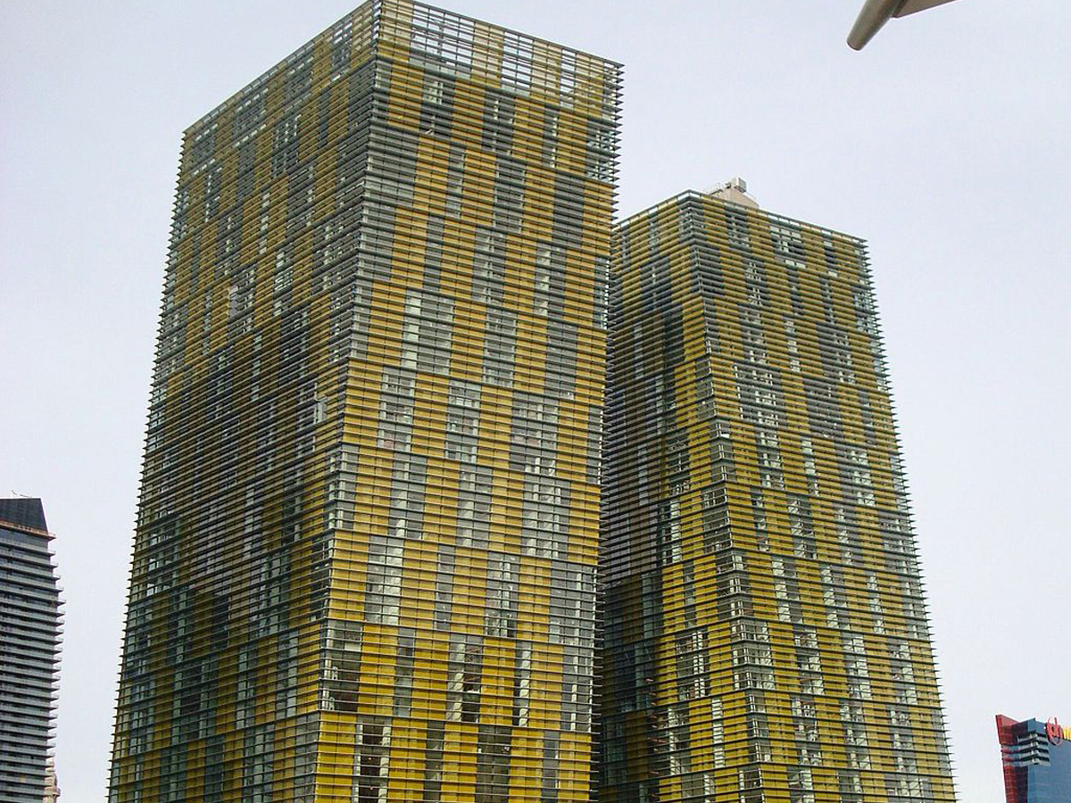
It’s not the veering that makes these towers unsightly—that’s actually pretty cool. Instead, it’s the dreadful mustard and metal color scheme they decided to go with that makes things look so off.
The two towers veer in opposite directions at exactly five degrees from normal. Veer Towers are home to luxury condominiums, all with a view of the Las Vegas skyline, and officially opened in 2010. In the lobbies of both towers, you can find sculptures by artist Richard Long, who used mud in his works that was imported all the way from Great Britain.
 Author
James Stephens
Last Updated: March 30, 2026