Wyoming: The Dick Cheney Federal Building in Casper
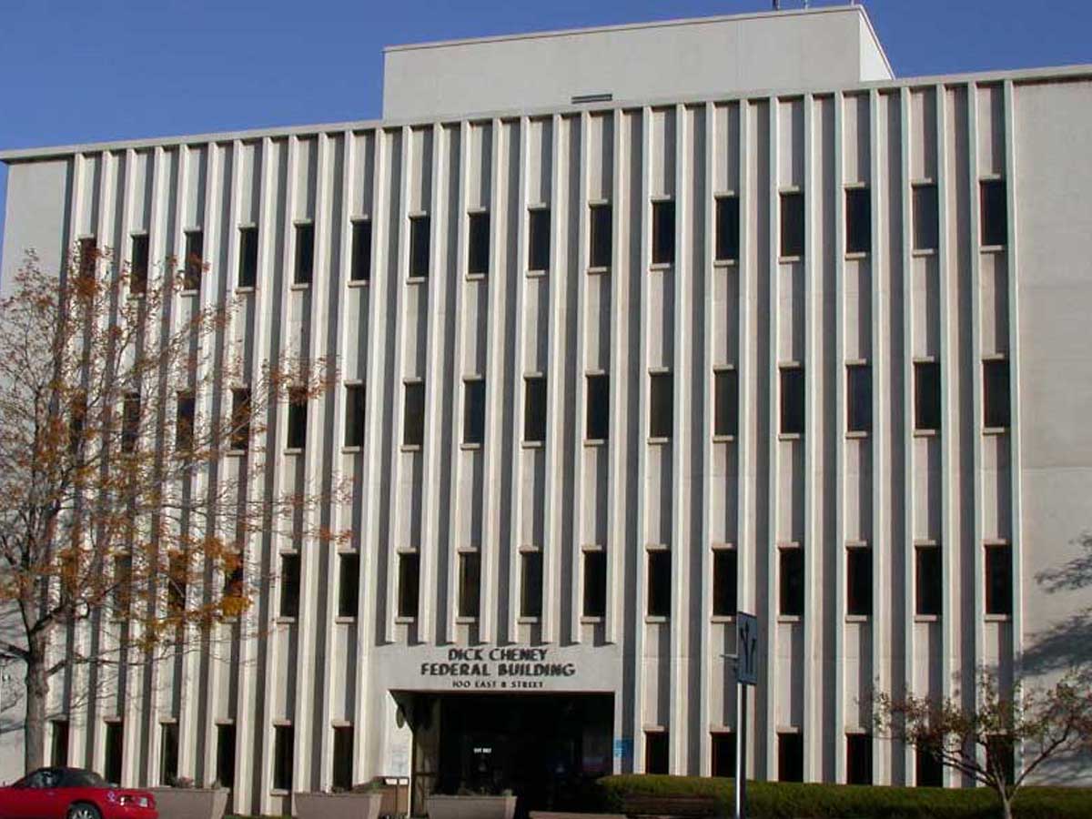
The federal government may not be good at much, but they’re true experts at designing the most depressing, drab buildings imaginable. Wyoming deserves better than this.
This federal center was named after former vice president Dick Cheney, who was also a state representative for Wyoming earlier in his political career. However, the building is actually much older than its name--it was originally constructed in 1970 Engstrom & Deines/J.T. Banner & Associates.
Vermont: House II in Hardwick
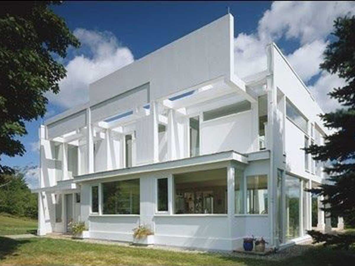
This home in Vermont is apparently on the market. For a mere $2 million, this hideous house could be yours! I’d pay $2 million to never have to look at it again, personally.
The building was designed by American architect Peter Eisenman in the late 1960s, and it received a renovation in the early 2000s. This house would have probably had more success in an urban environment, but, considering that it's in the middle of rural Vermont, it sticks out like a sore thumb.
Alaska: The Westmark Hotel in Anchorage
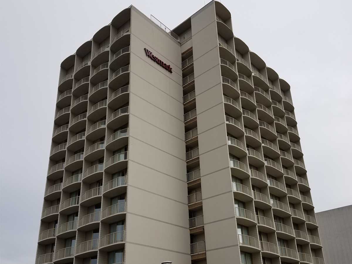
You might be in a hotel in Alaska when you stay at the Westmark in Anchorage, but this building will make you feel like a citizen of the Soviet Union!
Despite the drab exterior of this place, it managed to find some success among travelers, as its online reviews are solidly in the middle--which isn't great, but it's more than you would expect from just looking at the place. It's honestly in a decent location if you're looking to explore downtown Anchorage.
North Dakota: State Capitol Building in Bismarck
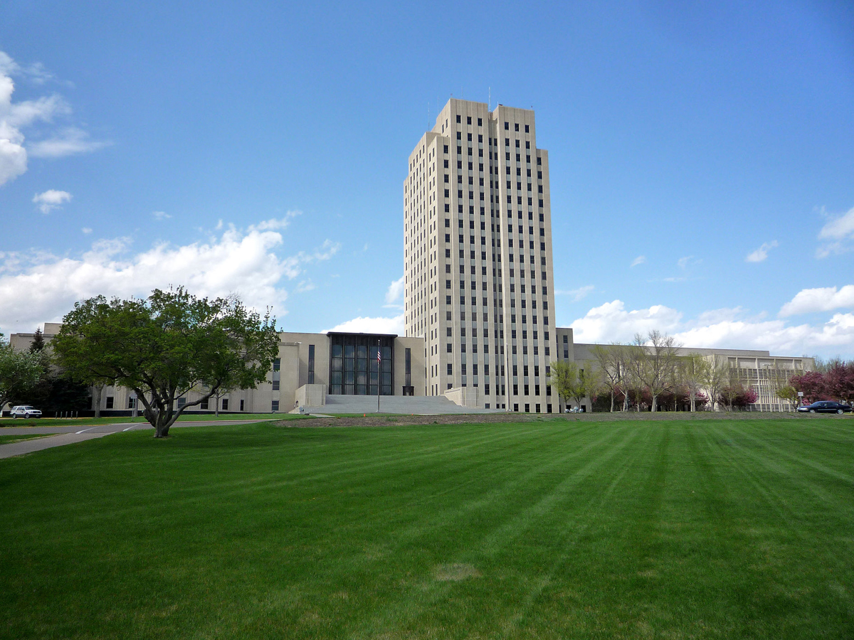
This building is allegedly done in the classic Art Deco style, but it’s the most depressing example of it we’ve ever seen. If this was in the middle of NYC you might not give it a second thought, but it definitely stands out in a bad way in North Dakota.
The capitol building is one of the tallest buildings in the state, which is probably how it got its nickname, "Skyscraper of the Prairie." The tower was designed by local North Dakota architects W.F. Kurke and Joseph Bell DeRemer, and construction was completed in the early 1930s.
South Dakota: The Qwest Tower in Sioux Falls
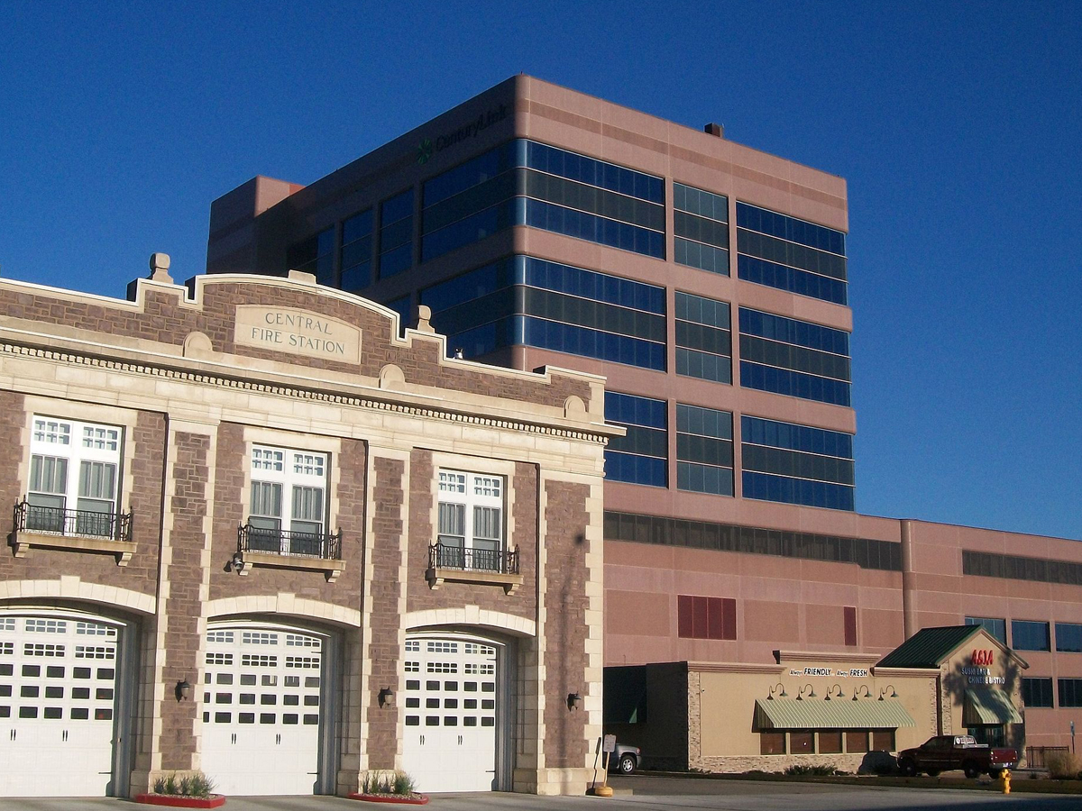
The CenturyLink Tower (formerly Qwest) may be the ugliest building in South Dakota, but that’s not it’s only claim to fame. At a “gargantuan” 11 stories, it’s also the tallest building in the state.
The building was originally completed in 1962, but it looked quite a bit different than it does today. Originally, the tower had a facade of white stone, but, because of structural issues, this all had to come down. It was only then that the current exterior was installed. Additionally, one portion of the building was demolished to make room for more parking in 2011.
Rhode Island: The Apex Building in Pawtucket

Despite what it looks like, this building is not a failed Pizza Hut. It may stand out in the surrounding area, but it’s definitely not in a good way.
The building was constructed in the 1960s to house the Apex Department Store, and it's unusual shape actually had a purpose--it was a workaround of the restrictive sign ordinances in the area. While there have been numerous plans to redevelop the building over the years, nothing has come to fruition yet.
Delaware: Rollins Building Heliport in Wilmington

If you’re going to make a giant building that will stick out like a sore thumb in the surrounding area, it’s got to look good. Unfortunately, this thing just looks like a giant, adobe brick prison.
The looming tower was built by John W. Rollins, a Delaware entrepreneur and politician, who had great business success in the state. For many years, this building was the headquarters for his many companies that he ran. Currently, the tower is occupied by Wells Fargo.
Montana: Health Sciences Building at the University of Montana
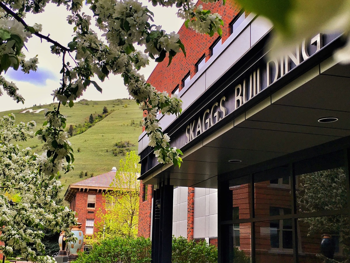
This building looks like a pile of the most boring children’s blocks ever. What are they thinking up in Montana?
The department seems to be thriving, so that's good at least--you can never have enough health sciences. But it's just unfortunate for all those students who have to make their way into this ugly building, day after day, semester after semester.
Maine: School of Law Building at the University of Maine in Portland
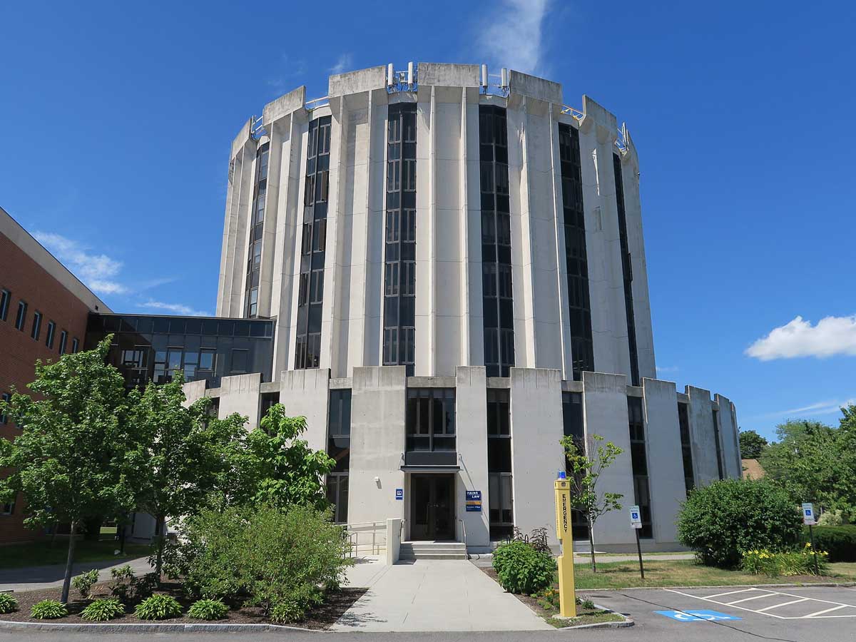
Will you learn to practice law in this building or will you be chained to the walls and left to rot in this Tower of London-looking monstrosity? I think your chances are 50/50.
The building was designed a Maine architect firm, Wadsworth, Boston, Dimick, Mercer and Weatherill, and was completed in 1972. Additionally, it received an expansion of the first floor in 1993. The building is considered to be in the brutalist style of architecture, which is definitely a rarity for Maine and New England in general.
New Hampshire: The former Department of Employment Security Building in Concord
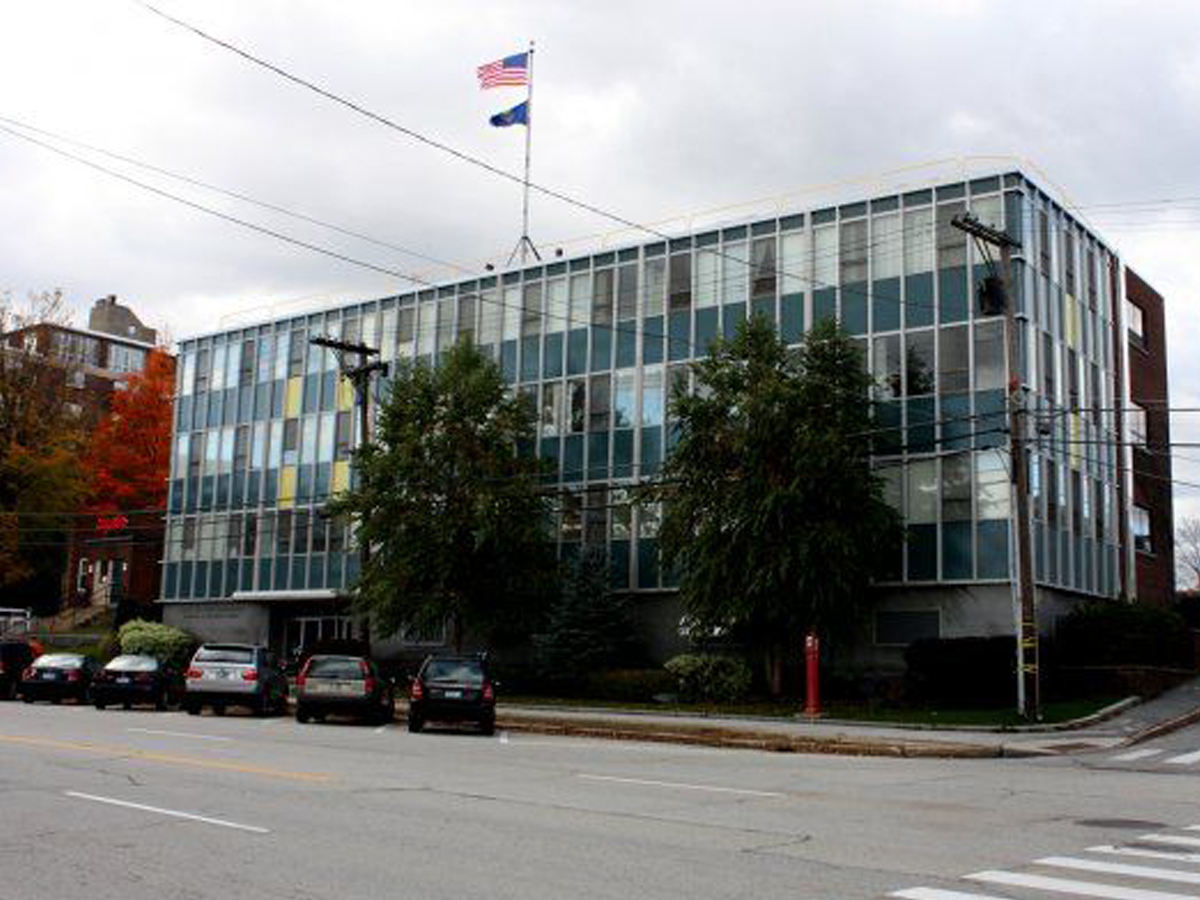
This building is fine if you’re into giant, glass trailers from the 1970s. Unfortunately, there aren’t many fans of those in the world.
After the Department of Employment moved its operations out of the building, it's pretty much sat empty. At the time of its completion in 1958, it was meant to look modern and powerful, but over the years not many people have agreed with those descriptions. Its fate in the future still remains to be seen.
Hawaii: One Waterfront Towers
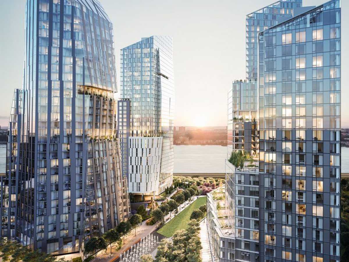
Hawaii is home to some of the most beautiful landscapes in the world, some of which are obscured by these hideous, glass skyscrapers. How hard would it be to toss these things straight into a volcano?
The towers were originally completed in 1990 and were part of the vision of developer Bruce Stark. When it was built, Stark wanted it to be an unforgettable landmark in Hawaii, and he definitely got his wish--just not in the way he was hoping. And the fact that it's just a bunch of condos doesn't do anything for its appeal either.
Idaho: Zions Bank Building in Boise
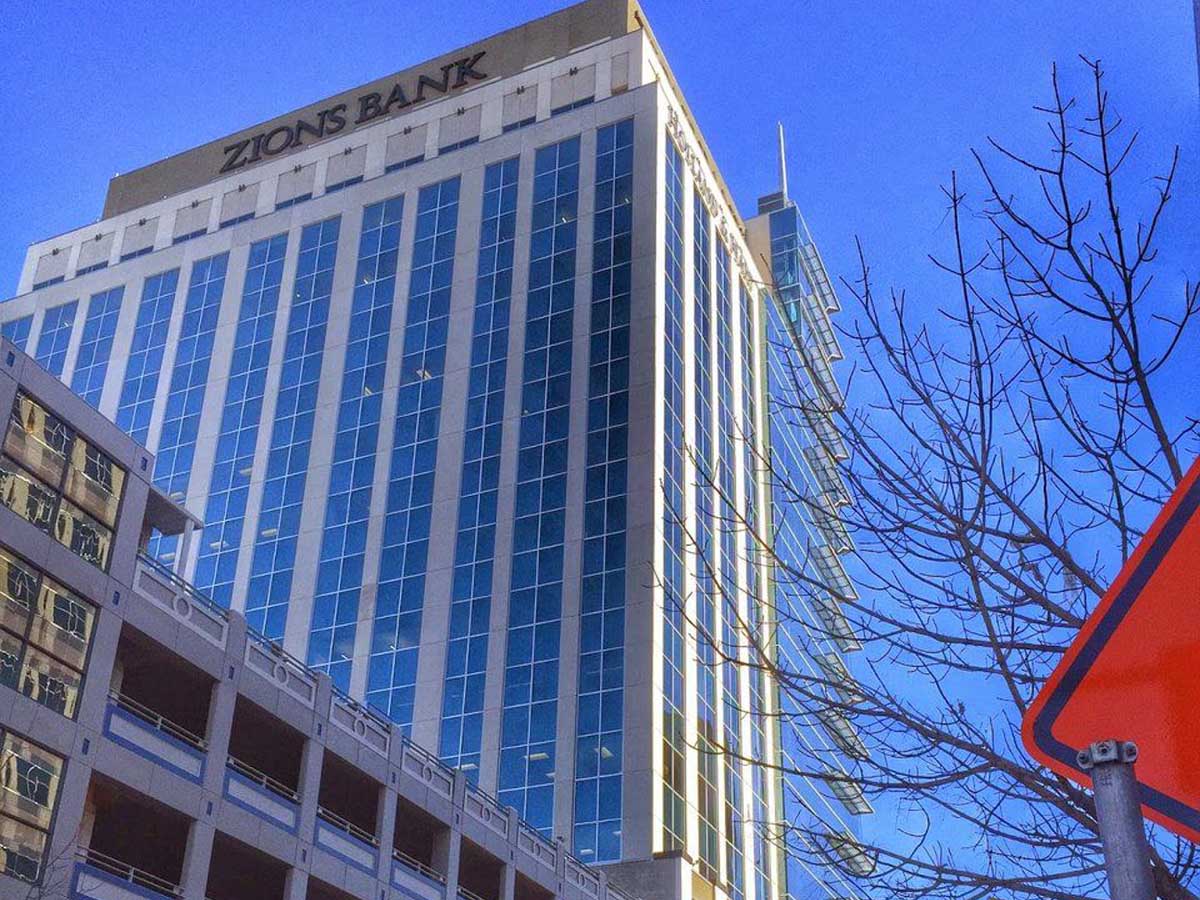
Let’s hope that Zions Bank is better at money than they are at architecture. This building looks like a classic skyscraper is slowly being devoured by a more modern one.
Despite its unfortunate appearance, the building still has one impressive claim to fame--it's the tallest building in the state of Idaho. It was completed in 2014, and before its construction, the area had just been a vacant lot since 1984. Interestingly, the design for the building was altered because it was said that the spire looked too much like those used on Mormon temples.
West Virginia: The Bank of Mullens Building in Mullens
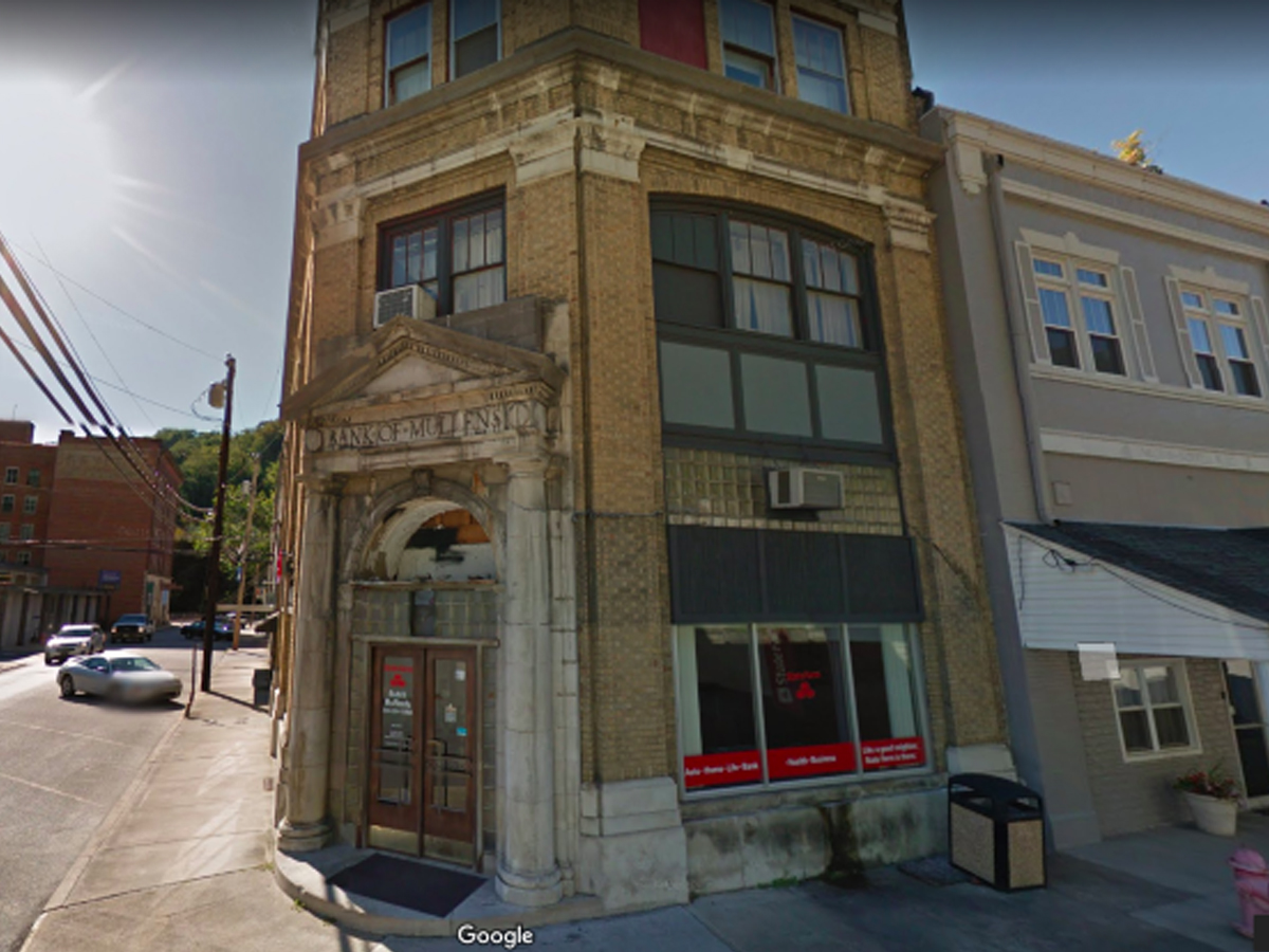
This poor building in West Virginia is way past its prime, but no one will put it out of its misery. It’s become an eyesore to locals and visitors alike.
The Bank of Mullens appears to be long gone, and the building probably should have gone along with it. What's worse is that this building is part of "historic" downtown in the city--which basically amounts to a collection of other old buildings that are also falling into disrepair.
Nebraska: Omaha Police Department HQ
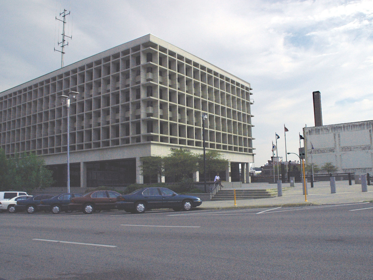
Hey, just because it’s a police building doesn’t mean it has to look like the world’s most depressing prison on the outside. This stone box is the worst that Nebraska has to offer.
The building was completed in the 1970s, and, terrifyingly, apparently contained a lot of asbestos. It had some renovations over the years to improve the safety of the inside, but one thing that's remained constant is its dreadfully ugly exterior.
New Mexico: University of New Mexico’s Humanities Building
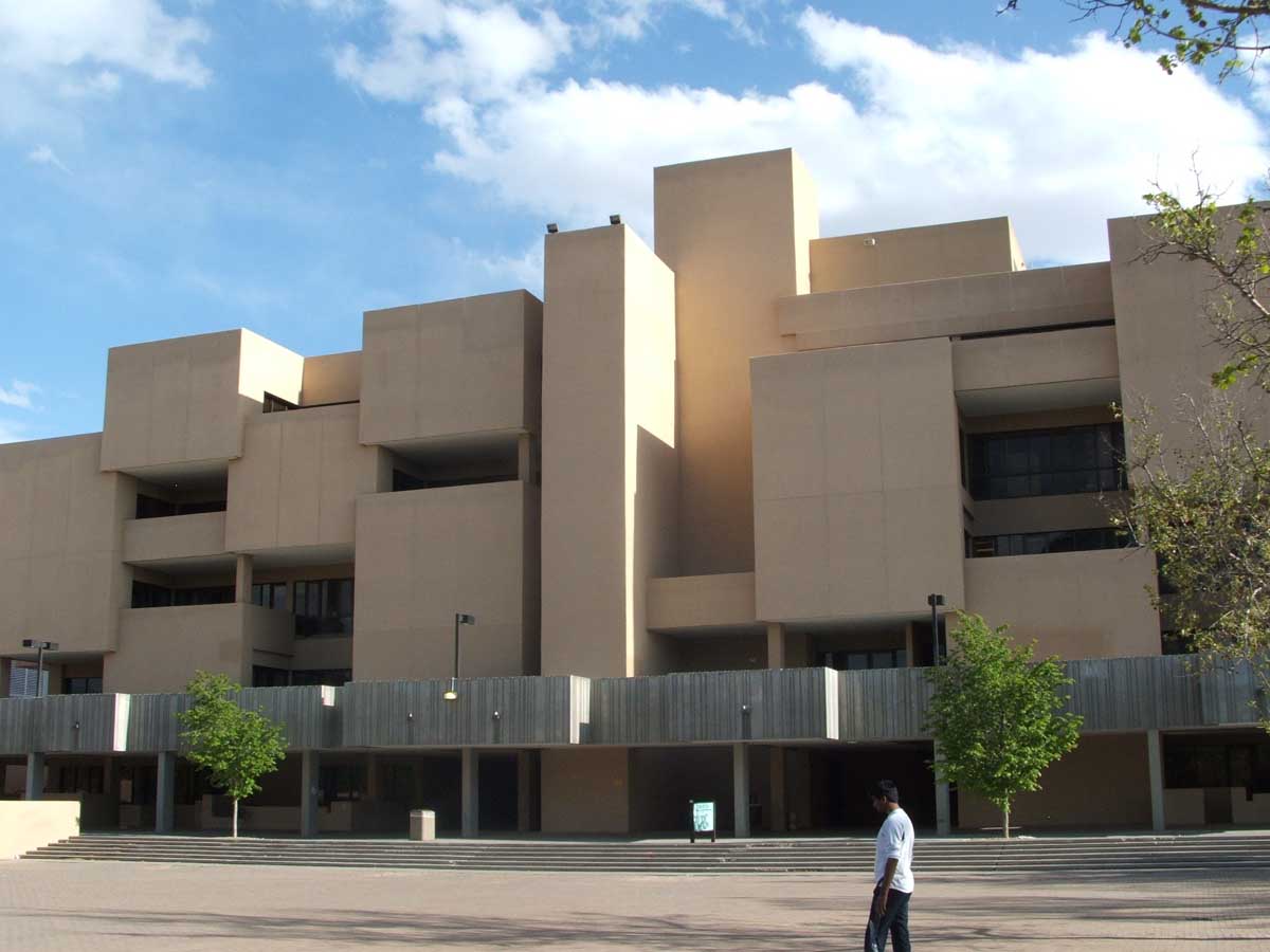
This building looks like the worst brick-laying job we’ve ever seen. And considering how the windows are arranged, it seems like the designer was actively trying to prevent natural light from reaching those inside.
The building officially opened for business in 1974, and interestingly enough, it's not the most infamous building the architects behind it ever designed. That distinction goes to their design work for the laboratory where the first atomic bombs were tested in Los Alamos. Although it may be ugly to look at, at least this building won't give you radiation poisoning.
Kansas: Wescoe Hall at the University of Kansas
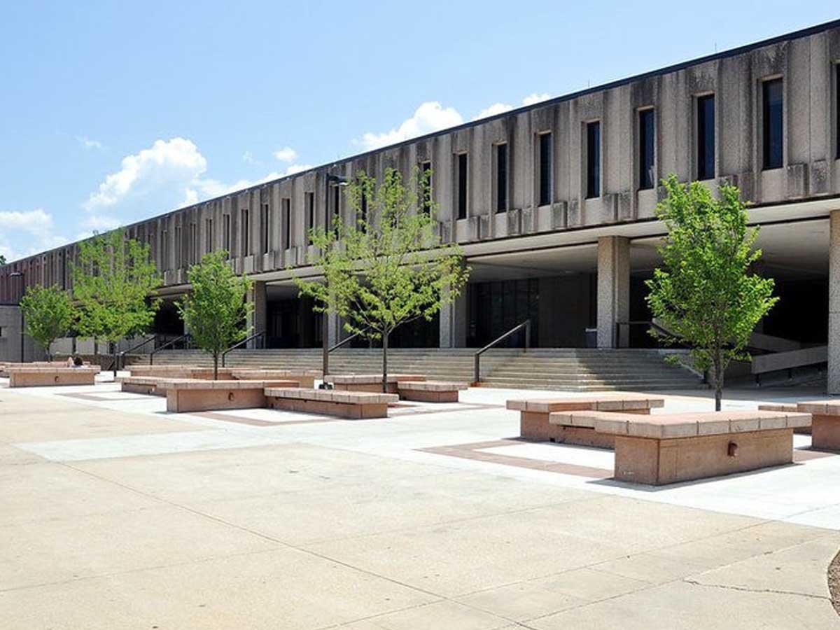
This cement trailer on stilts graces the campus of the University of Kansas. The building is allegedly meant to represent “man’s quest for life.” Let’s just hope it’s a life far away from this ugly structure.
Wescoe is home to classrooms for the departments of liberal arts and humanities and first opened in 1973. From the get go, most people had nothing nice to say about how the building looks despite all the hype surrounding its construction--at the time, it was the largest building project that the state of Kansas had ever undertaken.
Mississippi: The Gold Strike Casino Resort in Robinsonville
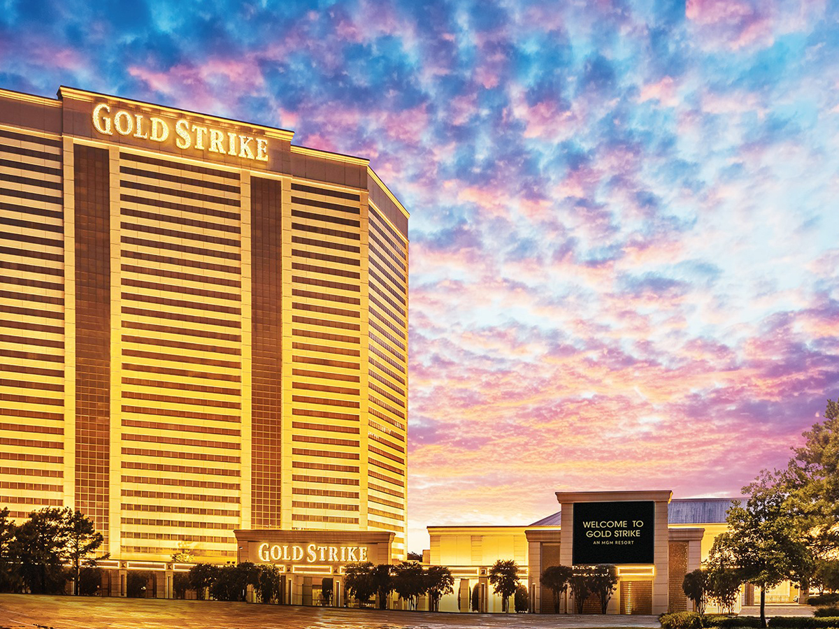
There’s nothing particularly beautiful about Tunica in general, but the Gold Strike Casino takes the cake. Come lose your money in this gold prison! And don’t even think about finding a room with a view--it’s all Mississippi flatlands and casinos as far as the eye can see.
The casino originally opened in 1994 under the name Circus Circus Tunica and got major upgrades a little more than a decade later in 2008. At the time of its opening, it was officially the tallest building in the state of Mississippi at 31 stories. Even today, it's still one of the easiest to spot buildings in the state.
Arkansas: John Paul Hammerschmidt Federal Building in Fayetteville
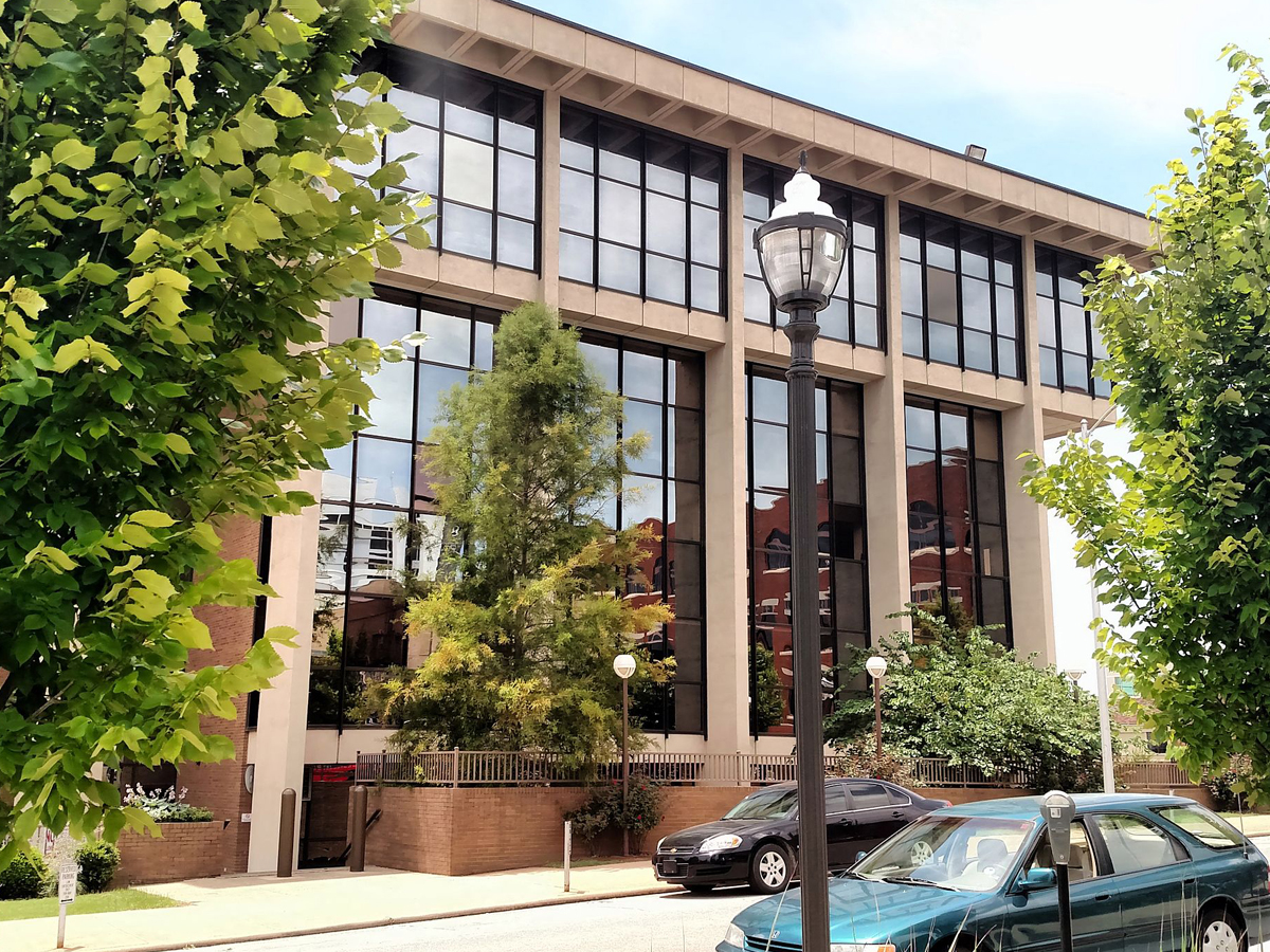
In a town known for its beauty, the John Paul Hammerschmidt Building in Fayetteville, AR sticks out like a sore thumb. It would probably be a step up if this thing were dreadfully ugly and not just dull beyond belief.
The building is home to the US District Court for western Arkansas, and it's located near the historic district in Fayetteville. It was named after Arkansas politician John Paul Hammerschmidt, who served for 13 terms in the US House of Representatives.
Nevada: Veer Towers in Las Vegas
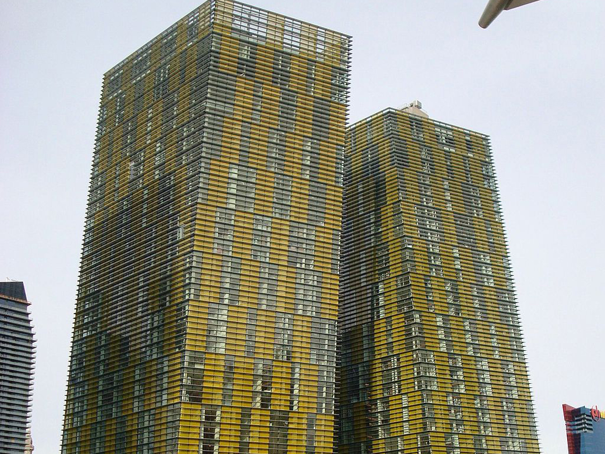
It’s not the veering that makes these towers ugly—that’s actually pretty cool. Instead, it’s the dreadful mustard and metal color scheme they decided to go with that makes things look so ugly.
The two towers veer in opposite directions at exactly five degrees from normal. Veer Towers are home to luxury condominiums, all with a view of the Las Vegas skyline, and officially opened in 2010. In the lobbies of both towers, you can find sculptures by artist Richard Long, who used mud in his works that was imported all the way from Great Britain.
Iowa: English-Philosophy Building at the University of Iowa
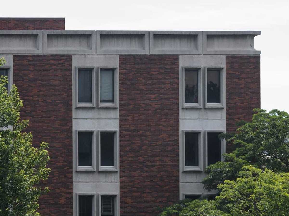
Students taking classes in the English-Philosophy building at the University of Iowa don’t have to worry about being distracted by beautiful architecture--because there’s none to be found here.
While the building might not be much to look at, it houses one of the most prestigious writing programs in the country--the Iowa Writers' Workshop. The graduate program has produced numerous famous and successful writers, and 29 former students have won the Pulitzer Prize since studying there.
Utah: Salt Lake City Courthouse
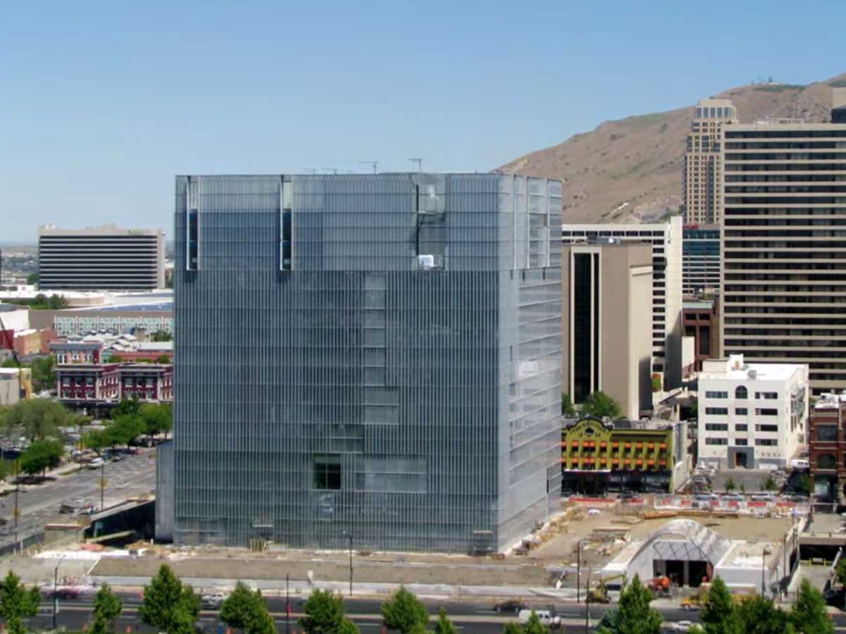
Nothing says “courthouse” like a giant, metal cube. Maybe this one isn’t ugly after all--it’s just 200 years before its time.
Known officially as the Orrin G. Hatch United States Courthouse, this big metal box officially opened in 2014, and it took literally no time at all for people to develop polarizing opinions about it. While architects may have ranted and raved about its brilliance, most other people found it to be an eyesore.
Connecticut: The Pirelli Building in New Haven
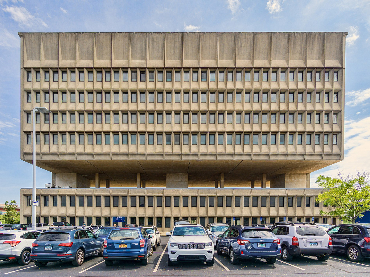
I can’t help but feel like this building was designed upside down. That being said, it still wouldn’t look great even if they were to flip it over.
This confused building was first completed in 1970 and was originally home to the Armstrong Rubber Company. In 2003, IKEA purchased the building but left it unused for years, much to the chagrin of the structure's misguided fans. However, they recently announced their plans to turn it into a hotel and conference center.
Oklahoma: Weokie Credit Union in Oklahoma City
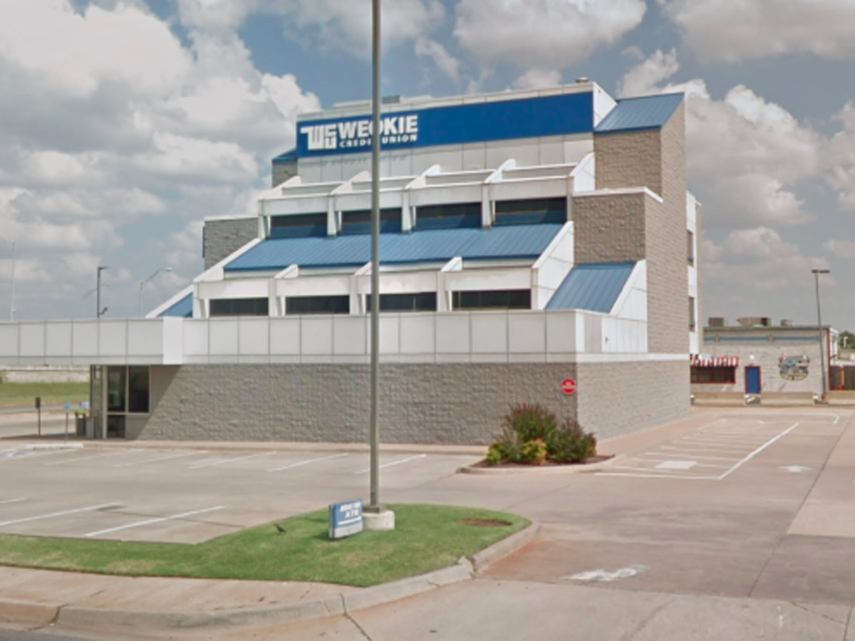
Clearly, people are coming to the Weokie Credit Union for financial services and not the architecture, which is lucky for them because this building is truly baffling. I hope this negative review won’t impact my credit score!
The Weokie Credit Union was officially founded in 1969 by employees of the Western Electric Plant in Oklahoma City, and they're still going strong today with one of the largest financial institutions in the state. Their financing might be great, but that building is still unforgivable.
Oregon: The Portland Building in Portland
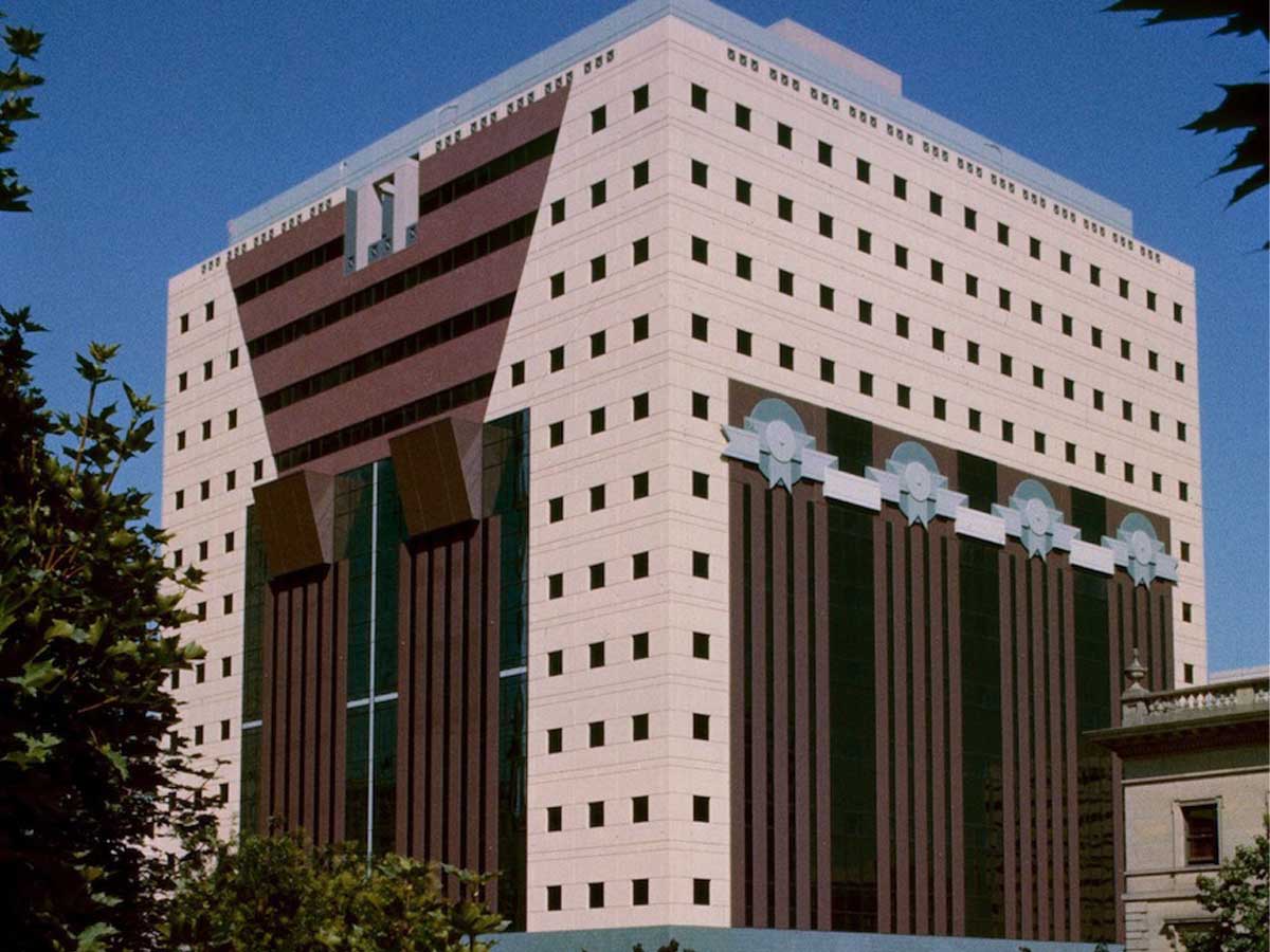
The Portland Building got to the Art Deco party a few decades too late. Although it looks like this building is straight out of the 1920s, it was actually completed in the '80s.
Within this anachronistic building, you'll find offices for the City of Portland, which is surprisingly boring for a structure this busy-looking. Despite all the naysayers, when the building first opened it won architecture awards, which may mean that architects don't actually have a sense of style.
Kentucky: The Kaden Tower in Louisville
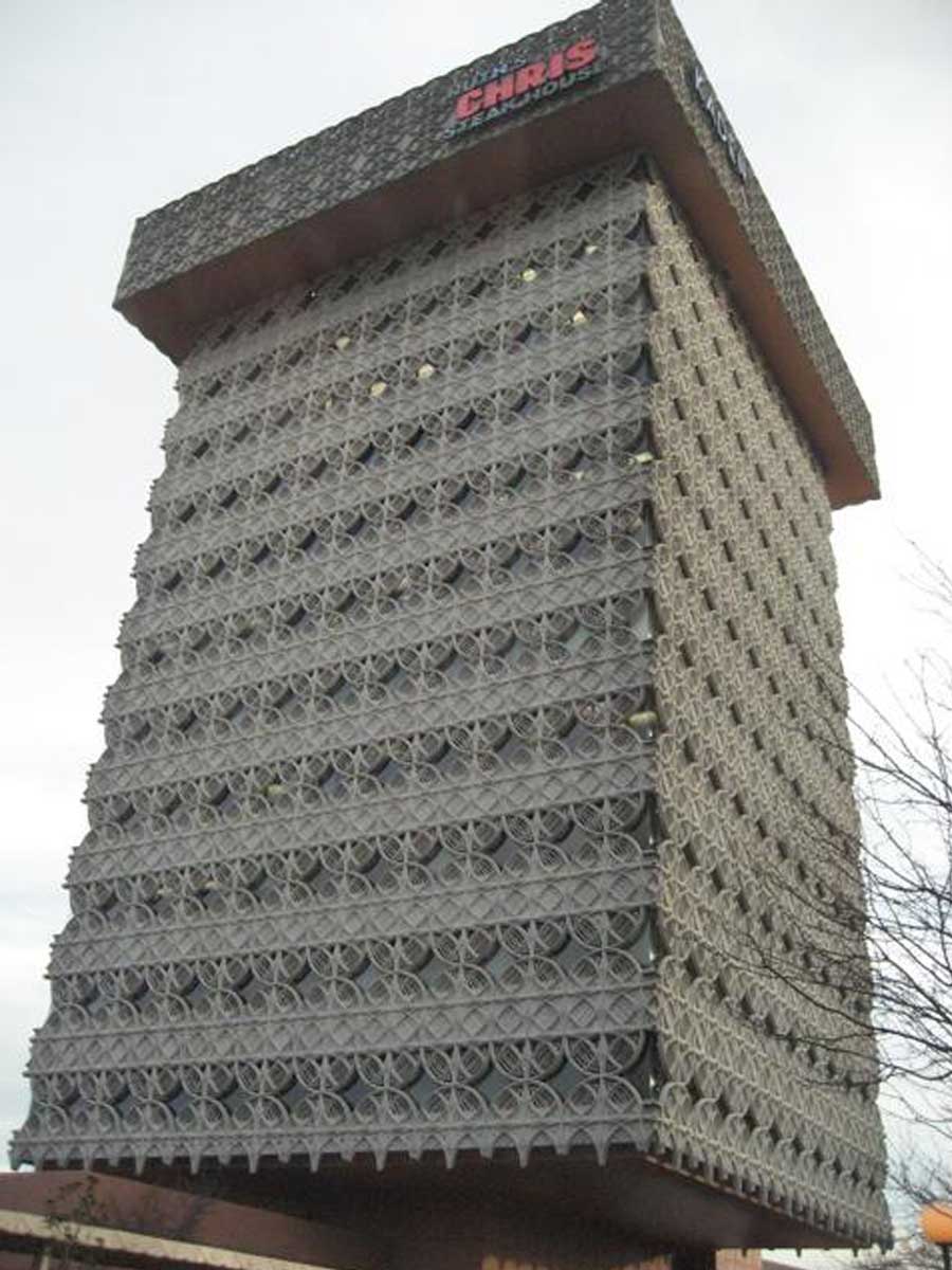
The Kaden Tower in Louisville was apparently designed by a student of the famous architect Frank Lloyd Wright. It seems like the guy could have used a few more lessons before he tried his hand at designing this building.
The building originally opened in 1966, and while it looks like the whole thing is covered in barbed wire, the official term for the design is "cantilevered structure with a suspended lacework facade." In addition to the weird look, it's also home to a weird combination of tenants--the bottom floors are offices, while there's a Ruth Chris Steakhouse on the top floor.
Louisiana: Old State Capitol Building in Baton Rouge
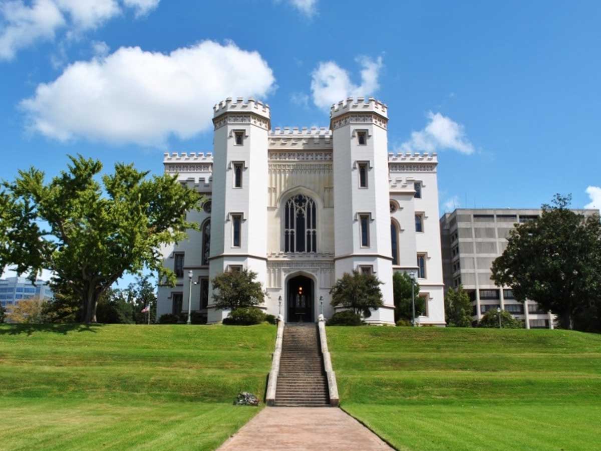
There’s nothing wrong with a good castle here and there, but this thing really sticks out in the Louisiana bayou. Let’s hope it sinks into a swamp.
The construction of the building took almost a decade in the middle of the 19th century, and it served as Louisiana's capitol until the 1930s. After being retired from service, the castle was renovated and restored in the 1990s as a museum of political history.
Alabama: The Government Plaza in Mobile
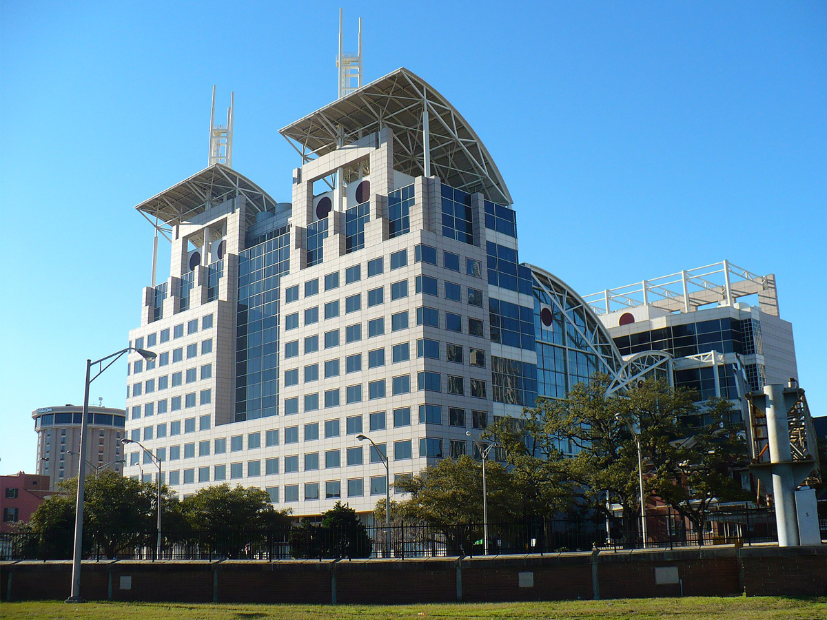
This building very much looks like a high-tech prison you’d find in a dystopian sci-fi movie set in 2050. But the city government building for Mobile, Alabama? I don’t see the resemblance.
The plaza was originally known as the City-County Administration building, but it was renamed in 2013 in honor of the outgoing mayor of Mobile, Samuel L. Jones. All that glass turned out to be not a great idea, because the building has struggled with leaks during heavy rain since its construction.
South Carolina: Holiday Inn Charleston-Riverview in Charleston
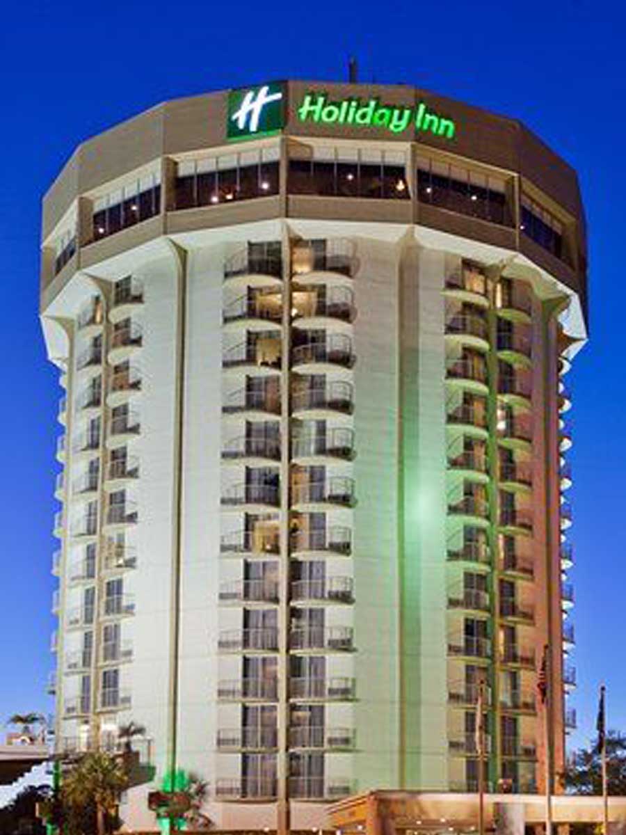
You might have a scenic view of Charleston if you’re looking out from the Holiday Inn, but the building itself is a real eyesore--unless you want to feel like you’re vacationing in a prison tower.
It seems like this is one hotel that has seen better days. Recent guests have left reviews that all hone in on the dated feel of the building and its lack of high-quality amenities. One particular review had this to say: "I’d describe it as dingy, small, outdated, overpriced and generally garbage."
Minnesota: The Frederick R. Weisman Art Museum in Minneapolis
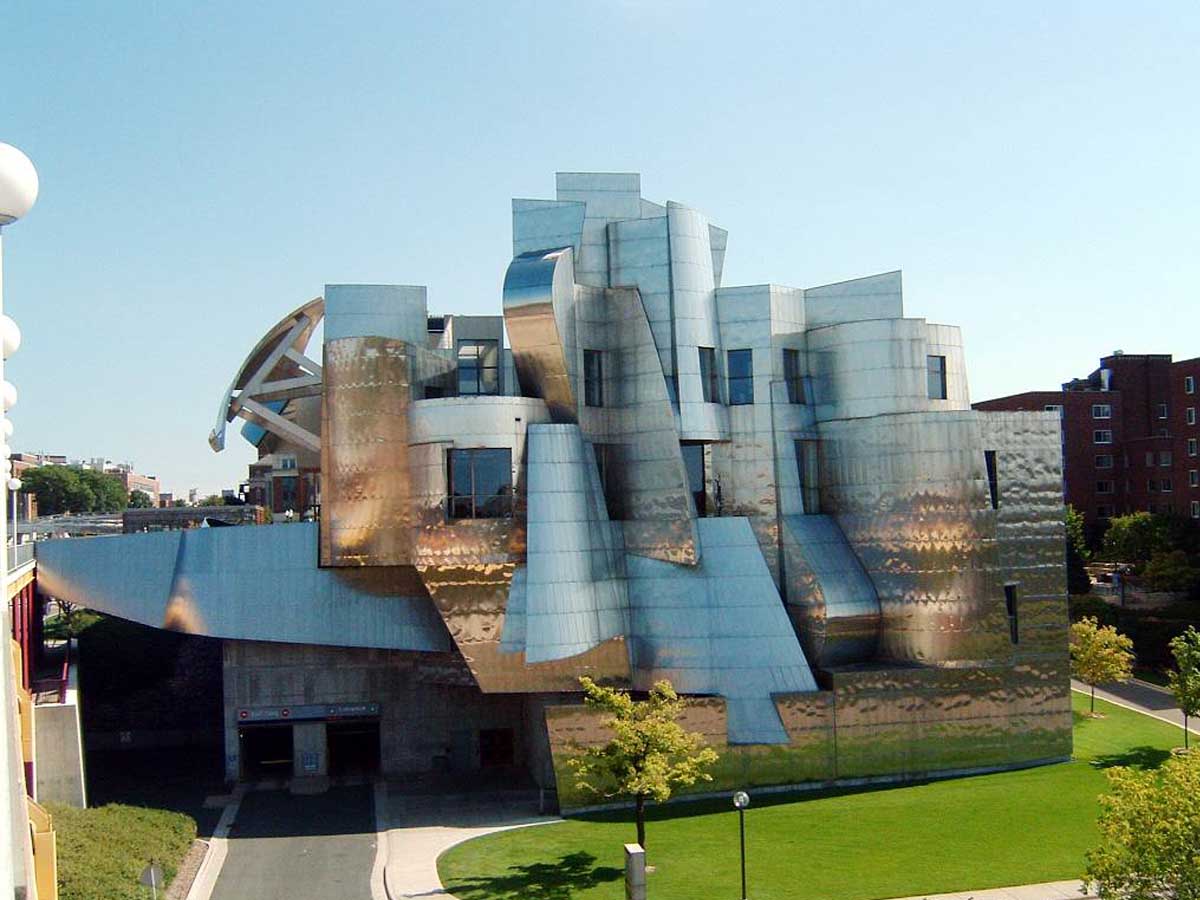
What is it with art museums being some of the ugliest buildings in existence? Considering what they house, you’d think they would go for, oh, I don’t know, a beautiful look. This aluminum foil monstrosity looks like something a five-year-old would design.
The building was designed by a world-famous architect, which is always a bad sign because they clearly can't be trusted to create beautiful buildings. However, credit where credit is due--this thing would be a nightmare to design with the aid of computers, but it was actually created before computer-aided design came to the world of architecture.
Colorado: Denver Art Museum
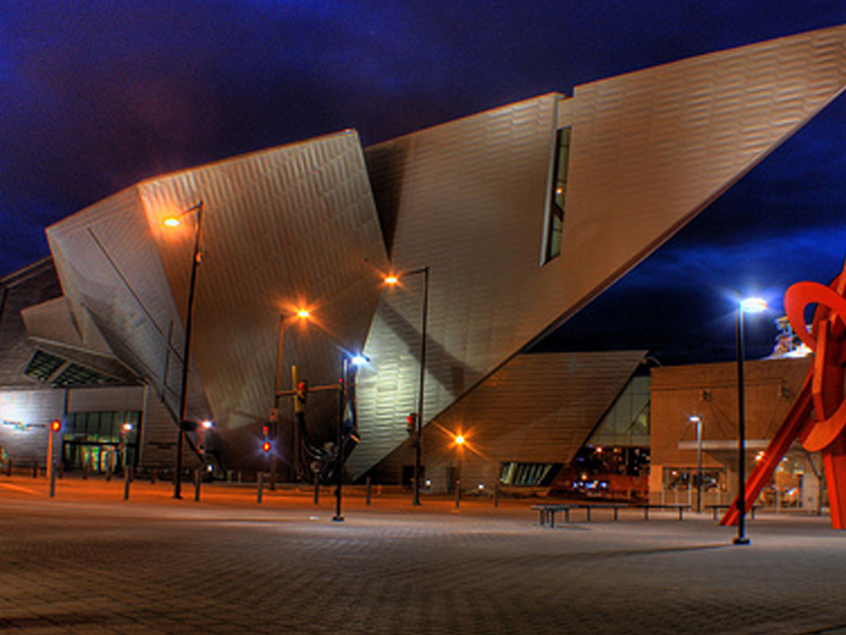
This design doesn’t scream “art museum” as much as it screams “supervillain’s lair.” The odd angles and sharp points are probably the furthest away from beautiful art that you can get.
Why is it that art museums are frequently designed to look like the most unappealing, unartistic buildings possible? Do with this quote from the designer what you will: "The project is not designed as a standalone building but as part of a composition of public spaces, monuments and gateways in this developing part of the city, contributing to the synergy amongst neighbors large and intimate."
Wisconsin: Humanities Building at UW Madison
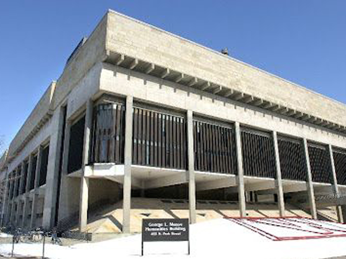
Welcome to prison! Err, I mean, welcome to the University of Wisconsin! This building may house the humanities department, but there’s not a thing human about this design.
However, apparently it's not just the outside that looks so cold and unforgiving--there are frequent complaints about the temperatures inside, and many faculty members located in the building will cover their floors in a pile of rugs in an attempt to stay warm. And best of luck trying to find the right classroom in its maze of halls!
Maryland: Morris A. Mechanic Theatre in Baltimore
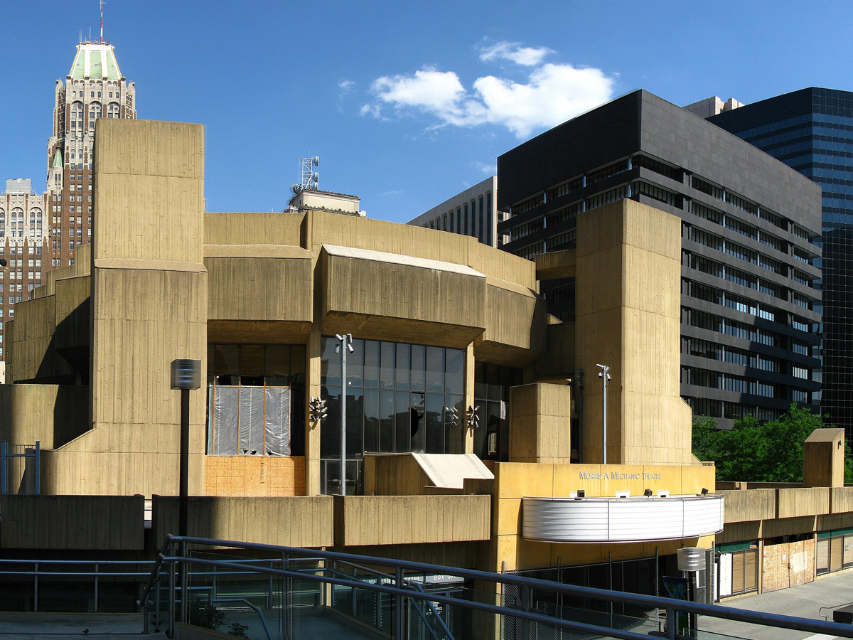
Why do strange shapes and drab concrete appear together so often in architecture? One or the other would be bad enough, but you can see for yourself how terrible they are when combined.
Unfortunately, the Morris A. Mechanic Theater met its end when it was demolished in 2014. However, that was a full ten years after the theater itself had ceased operations, so it seems like it was overdue. No construction of a new building has taken place since it was torn down, meaning this property is still an eyesore!
Missouri: The St. Louis Compton Hill Water Tower
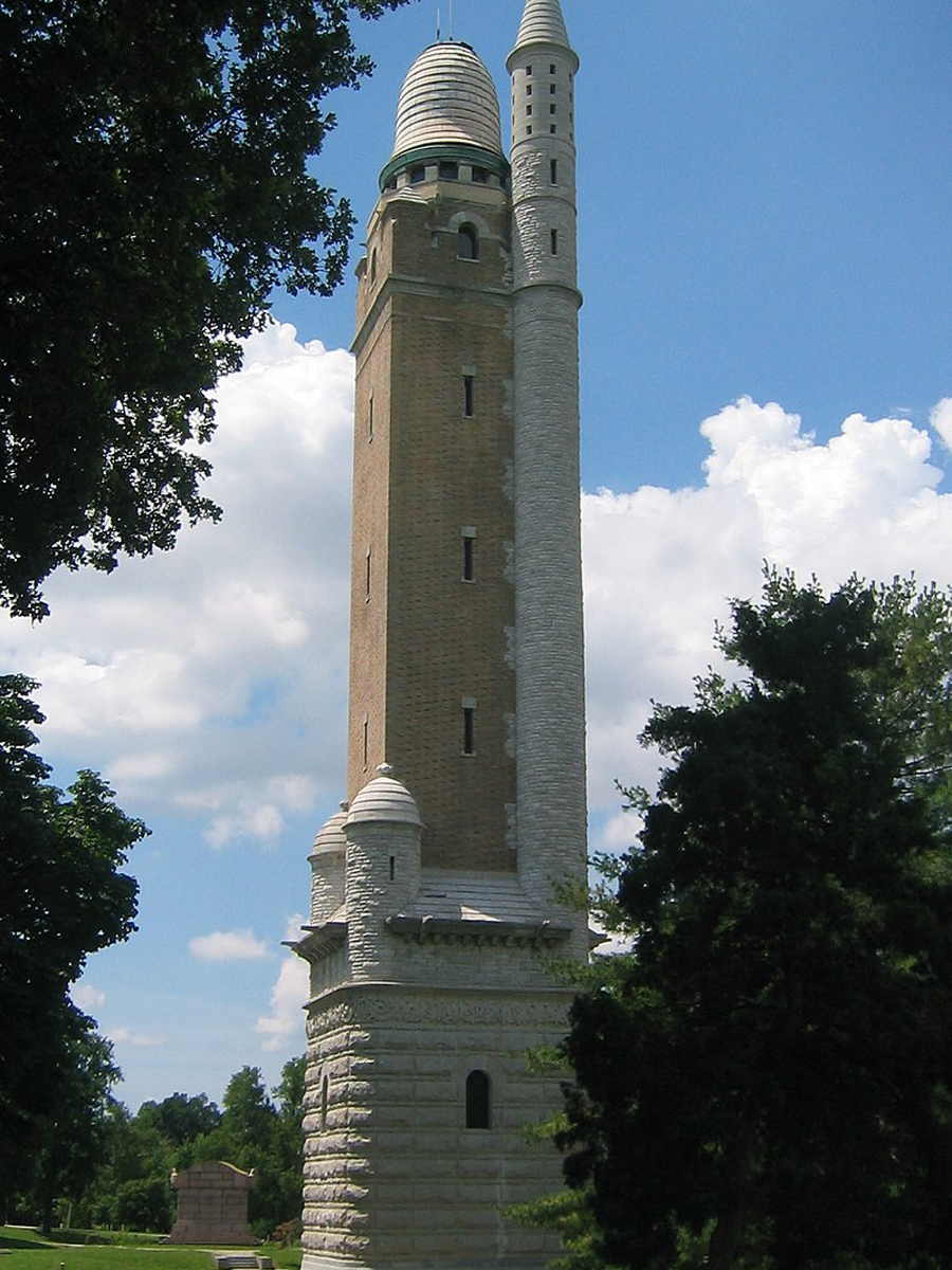
Did they run out of the original building supplies for this? Was there a fight about what this tower should look like? This mish-mash building is an eyesore, but it’s also a functioning water tower, so we guess it can stay...for now.
However, the unusual towers aren't actually the most controversial things about this property. That honor goes to The Naked Truth--a nude sculpture near the water tower that was gifted to St. Louis by the German-American Alliance in 1914. One donor managed to convince the artist to make the sculpture out of bronze instead of marble in the hopes that it would make the artwork look less nude.
Indiana: Minton–Capehart Federal Building
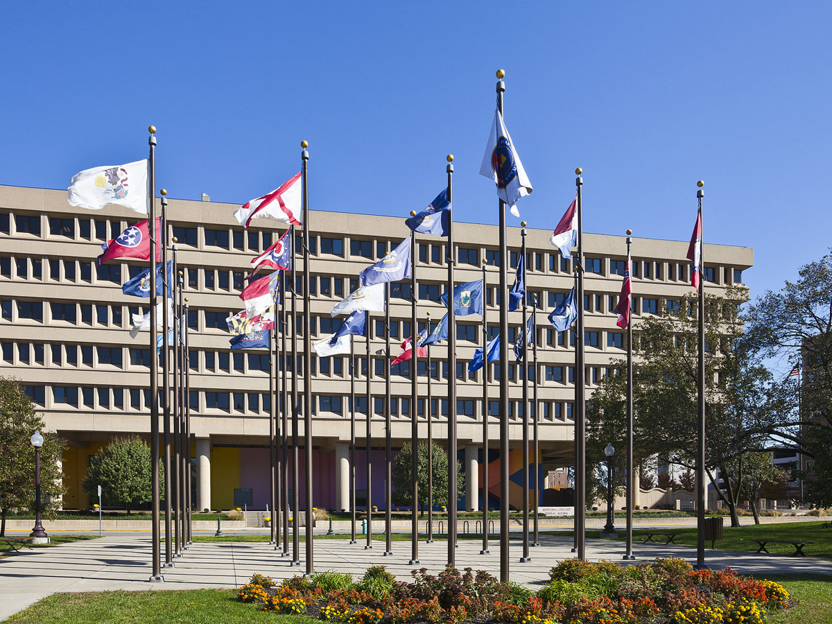
Why does it seem like people try to make government buildings as unappealing as possible? There’s actually a beautiful mural painted on the bottom level of the building (designed by the creator of the I <3 NY logo), but it’s overshadowed by the drab, upside-down pyramid on top of it.
In addition to being called one of the ugliest buildings in the state, the Minton-Capehart Federal Building has also been referred to a "pigeon coop", which is a much more vivid description of this building's shortcomings. Although the building was designed by local architects, they used the brutalist style, which feels much more at home in the Soviet Union than Indiana.
Tennessee: The AT&T Building in Nashville

If any building on this list is a supervillain’s lair, it’s the AT&T building in Nashville. The thing has horns for crying out loud!
Before AT&T, the building was home to other communications companies and was originally completed in 1994. Currently, it's the reigning champion as the tallest building within the state, and locals lovingly refer to this monstrosity as "the Batman building." I think they're giving this building more credit than it deserves.
Massachusetts: Boston City Hall
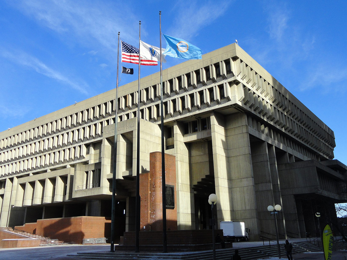
Surely an iconic American city like Boston deserves a better city hall than this? I wouldn’t want to step foot in this one unless I had to, and then I’d probably be lost forever in this labyrinthine, stone maze.
The Boston City Hall building was constructed in 1968, and it, like so many other buildings of the time, fell victim to one of architecture's ugliest trends--brutalism. City hall is already not a place that most people are thrilled to visit, but things are made even worse by what an eyesore the actual building is.
Arizona: The City Hall of Tempe
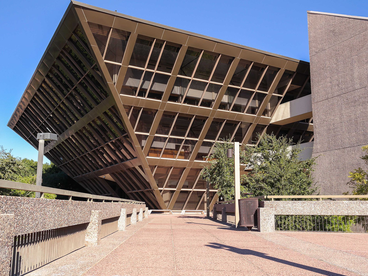
Municipal buildings don’t necessarily need to be sporting the most beautiful architecture known to man, but this is just ridiculous. Let’s leave the pyramid making to the ancient Egyptians--they at least had sense enough to build them right-side up.
The building was completed between 1969 and 1971 and was designed by Arizona natives Kemper Goodwin and Michael Goodwin. The city of Tempe had already rejected two of the architects' designs before they unveiled their idea for an upside-down pyramid--leaving us to wonder just how terrible the other ideas were if this was the one that eventually won out.
Washington: The Museum of Pop Culture in Seattle
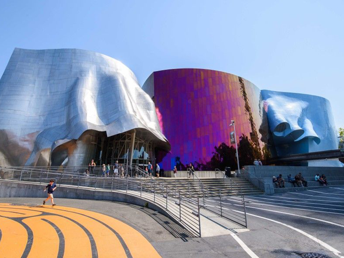
God forbid we have a museum in the United States that makes any sense. This is just another terrible variation on the “metal blob” theme. Lines and angles are not the enemy!
This building is only made uglier by the fact that it's located near the Seattle Space Needle--one of the most impressive works of architecture in the entire United States. The museum is allegedly supposed to look like the pieces of a smashed guitar, but I'm not sure if I see it.
Virginia: The Tycon office building in Vienna
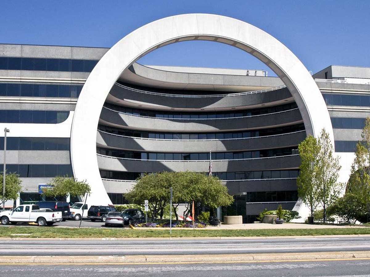
This one is a head-scratcher. It’s not too terrible looking if you’re into the whole sci-fi thing, but it’s just baffling that they went with this design for an office building. There’s nothing like being laid off and then having to pass through the Stargate.
Sci-fi is not the only comparison that people have made about the building, some folks who really hate it have also referred to it as a giant toilet bowl, and it's definitely giving off those vibes. The structure was constructed in 1983, and it's been controversial ever since.
New Jersey: American Dream Meadowlands Mall in East Rutherford
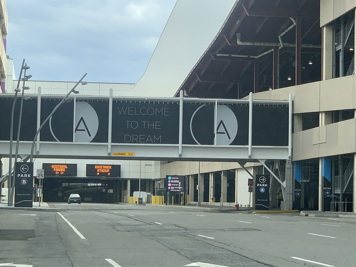
This mall isn’t as much of an American dream as it is an American nightmare. The whole thing is blindingly white on the outside and inside, which might actually be a good thing--you can’t see how ugly this building is if you’re blind.
Plans for the mall began all the way back in 2003, but it was 2019 before anything in the building actually opened thanks in large part to problems with financing the construction. Unfortunately, they pretty quickly had to close up shop again in 2020 thanks to the coronavirus pandemic.
Michigan: The MotorCity Casino and Hotel in Detroit
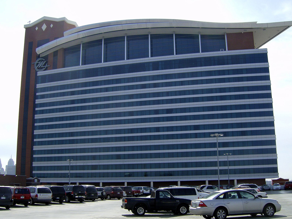
If this building were in Las Vegas, it would fit right in. Unfortunately, it’s in Detroit. Casinos are already depressing, but this design just makes this one more so.
The building might stand out from an architecture standpoint, but, surprisingly, it's not the only casino in Detroit--the city actually boasts four of them, despite their relative rarity in urban settings. The curved roof is supposed to be reminiscent of a car, but it just looks like a slick hairstyle to me.
North Carolina: The Biltmore Building in Asheville
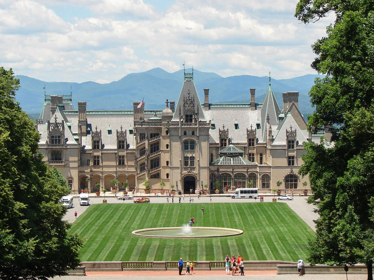
The Biltmore Estate is not hideous in and of itself, but it makes absolutely no sense within the context of North Carolina. This castle seems like it would be more at home in the Old Country as opposed to the Old South.
The Biltmore Estate is the largest privately owned home in the entire country, and it belongs to the historic Vanderbilt family. That shouldn't really come as a surprise to anyone, because it's clear from looking at it that it was designed by someone who had more money than sense.
Georgia: The Mercedes-Benz Stadium in Atlanta
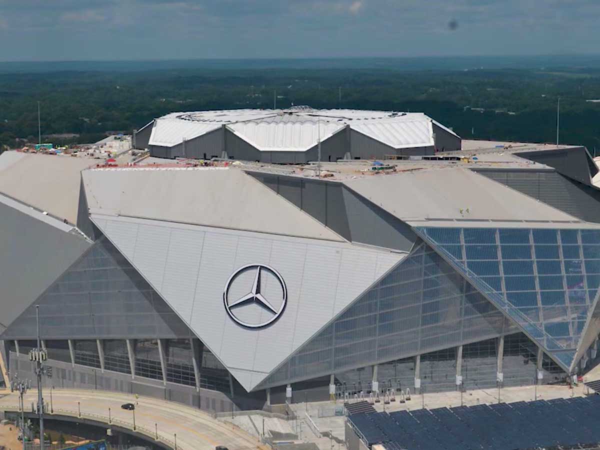
Why are pointy, angular buildings so popular? I don’t want to even look at this thing, much less go inside and watch the Falcons play.
The stadium officially opened in August of 2017 and acted as a replacement for the Georgia Dome, which itself had only been around since the 1990s. The unusual roof is retractable, which might help to explain why it looks so strange, but that doesn't make it any easier to look at.
Ohio: Peter B. Lewis Building at Case Western Reserve University
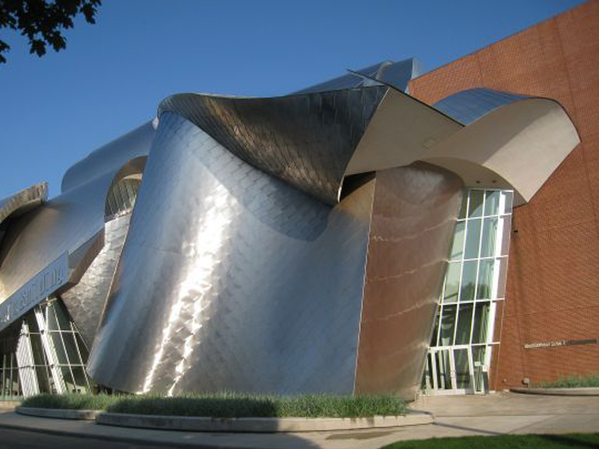
The whole “amorphous metal blob” thing is never going to work, no matter how many times architects inflict it upon us. And the brick portions of the building just make everything look even more ridiculous by comparison.
The building was designed by architect Frank Gehry, who has been responsible for several of the buildings on this list. What can we say, the man clearly loves metal blobs? The rationale for the design was this: "Faculty offices, classrooms and meeting areas are distributed on every floor to encourage informal interaction and complement the Weatherhead School’s learner-centered curricula."
Illinois: The Thompson Center in Chicago

The Thompson Center is allegedly a government building, but it looks like it could double as a UFO. I don’t think anyone would be upset if this thing blasted off into space and was never seen again.
The design of the building has posed problems over the years in terms of temperature control. Because the glass used wasn't insulated, the building really heats up in the summer and gets freezing in the winter. Recorded temperatures within the center have been as high as 90 degrees!
Pennsylvania: Wesley W. Posvar Hall at the University of Pittsburgh
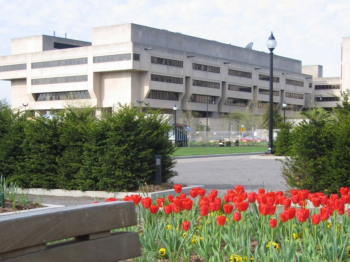
Why would a college make their living spaces look like giant, cement dungeons? Isn’t the whole point to make potential students excited to be there?
The Wesley W. Posvar Hall is the biggest building on campus, which is unfortunate because it makes it extremely hard to miss. The building was completed in 1973 and was done in the brutalist style, which is never a good sign in terms of looks. However, this building hasn't gotten as much hate as some others on this list.
New York: 432 Park Avenue
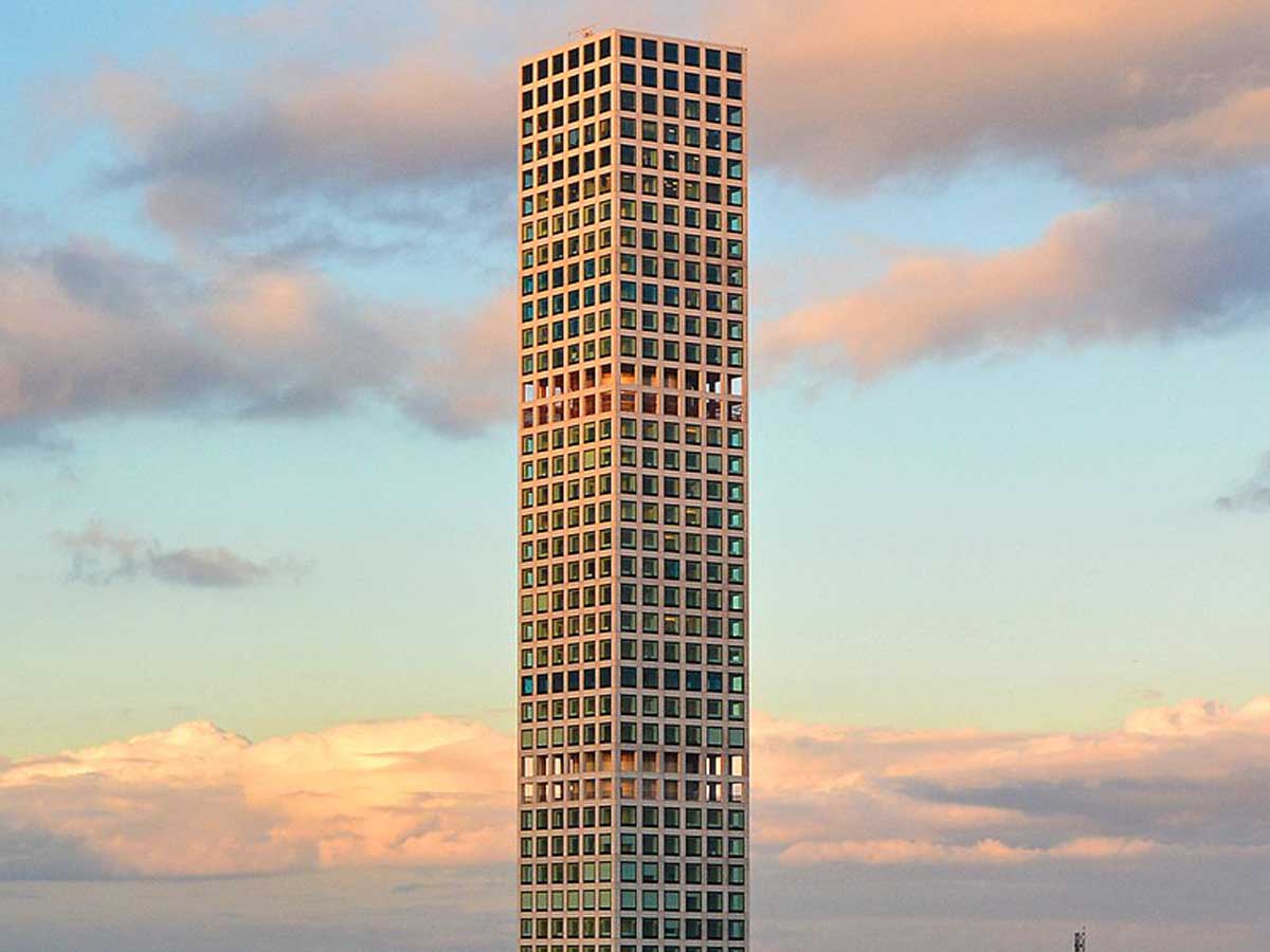
432 Park Avenue is one of the tallest residential buildings in the world. Unfortunately, it’s also one of the ugliest. The tower was completed in 2015, but its design makes it look like the whole thing is still covered in scaffolding.
It should come as no surprise that this eyesore is home to some of the most expensive condos in all of New York City, and the building even boasts private restaurants that are only available to residents. I don't get the appeal, though--you couldn't pay me to live in this place!
Florida: The Contemporary Resort at Disney World

Disney World is usually spot on when it comes to designing things, but what in the world were they thinking when they created the iconic (and ugly) Contemporary Resort? It looks like a futuristic Aztec pyramid, which is not something you would normally associate with Mickey Mouse.
Although it's not much to look at, the Contemporary Resort is one of Disney's most beloved places to stay. It's been around since day one of Disney World, opening on October 1st, 1971. In addition to being one of the ugliest buildings, it's also one of the loudest, since a monorail runs right through the middle of it.
Texas: Austin Courthouse
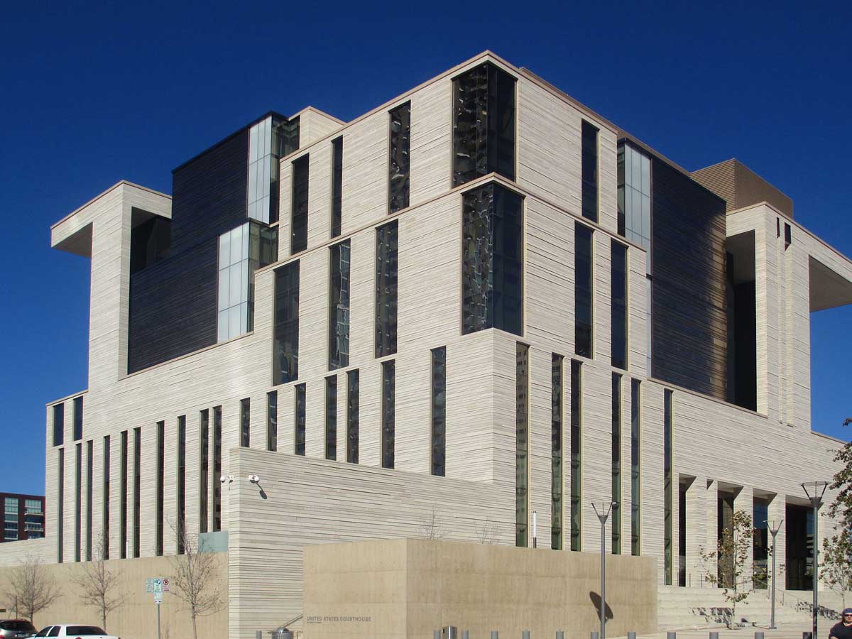
This building has a lot of different textures and materials going on. Unfortunately, none of them go together whatsoever. Everything is bigger in Texas--including their fails.
Construction on the building began in 2009, and it was completed by 2012, although we're sure that no one would have minded if this eyesore never opened. This was another building that was universally praised by architects while popular response was much more lukewarm.
California: A KFC in Los Angeles

KFC restaurants are not normally housed in gorgeous buildings, but this is too much even for fast food chicken. This industrial-themed KFC needs less sheet metal and more literally anything else.
The building was designed in the 1980s by a KFC franchisee, who, surprisingly, managed to get the OK from corporate headquarters to create this monstrosity. Customers have to get a little exercise if they want to get to that delicious chicken--orders are placed on the first floor but picked up on the second.
 Author
Alot Travel Team
Last Updated: June 03, 2021