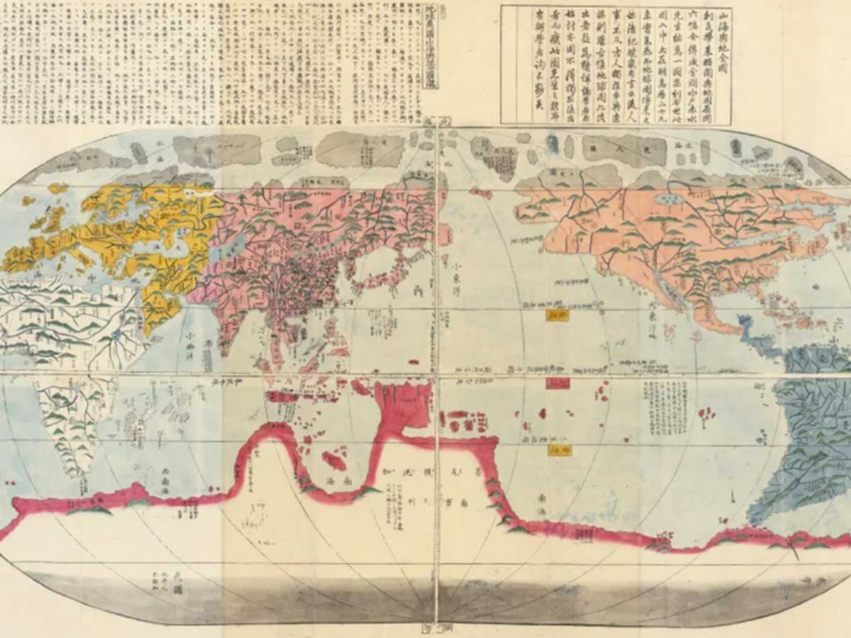
This world map from Japan 1785 is wildly incorrect about the layout of the globe, but that just illustrates how much we've learned about what the world looks like since the 18th century. If you look closely, you'll see a giant land mass covering the bottom of the southern hemisphere--a land mass that doesn't actually exist.
This map displays a non-existent continent known as Terra Australis--and it shows up frequently on maps from the 15th to the 18th centuries. At the time, people believed that all the land in the northern hemisphere had to be balanced out by land in the southern hemisphere. Thus, Terra Australis was invented despite the fact that it was conjecture and not based on direct observation.
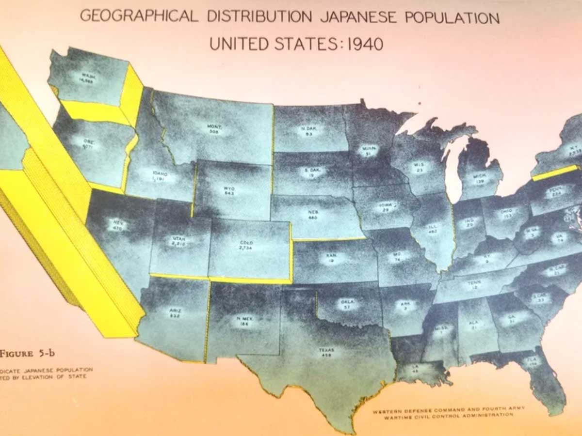
Considering that the west coast of the United States is located closest to Japan, it's no surprise that a majority of Japanese American citizens resided in California in 1940. Currently, the state has the second largest Japanese American population, behind Hawaii.
However, what's eerie about this map is the historical context. Only a few years after this map would have been published, more than 120,000 of these Japanese residents of the west coast would be forcibly interned in camps during World War II.
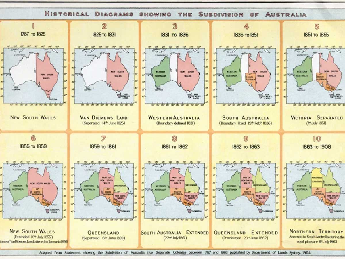
No matter how you slice it, Australia will always be the land of beautiful views and dangerous animals. However, as you can see from this map, the country has been divided up in a number of different ways over the years--sometimes in very quick succession.
Currently, Australia is divided into six main states: New South Wales, Queensland, South Australia, Tasmania, Victoria, and Western Australia. However, that wasn't always the case. Although, by 1863, the country was starting to look quite a bit what it looks like in its current version.
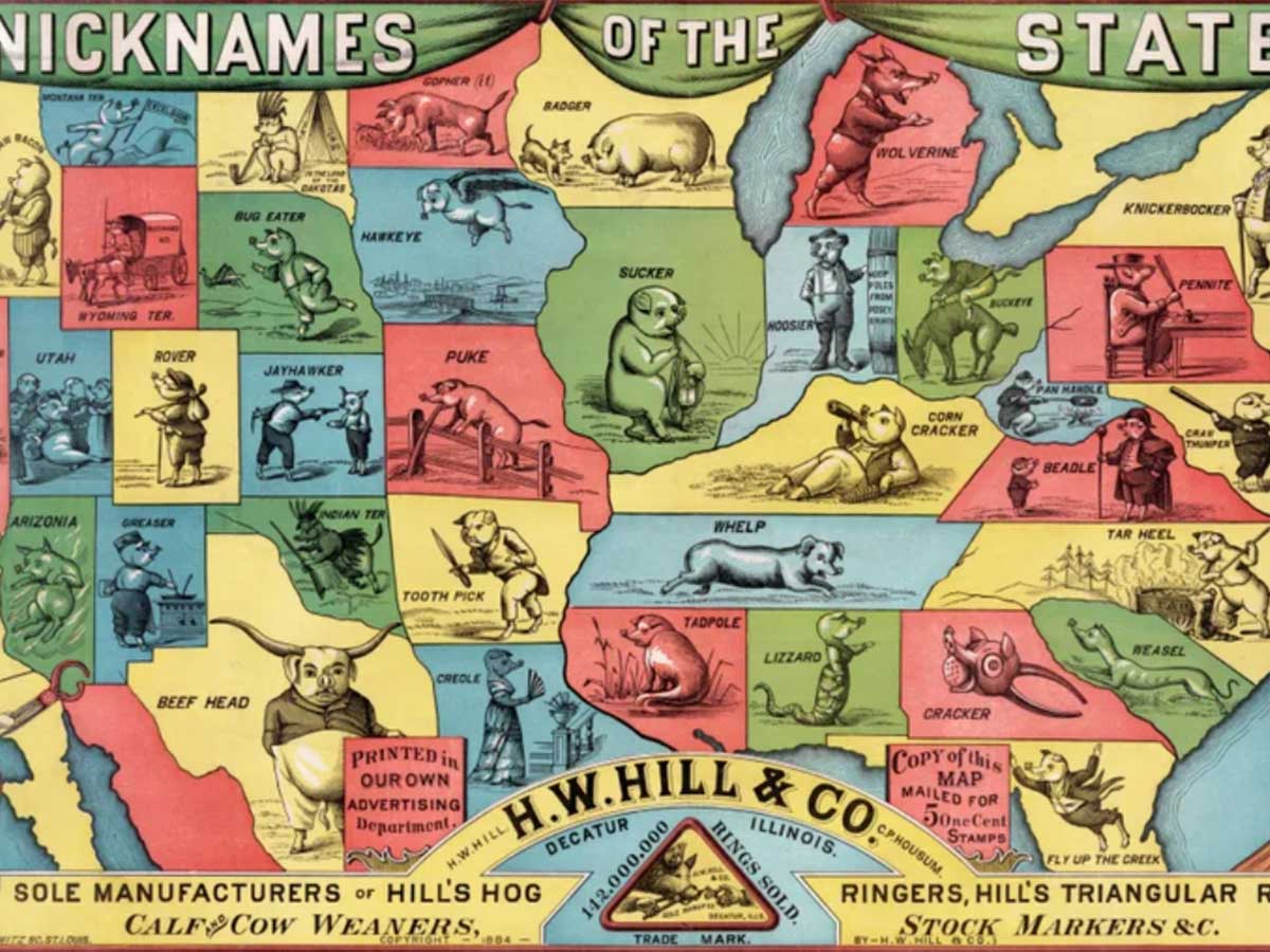
This map is unusual for a couple of reasons. Number one, it's one of the most poorly drawn maps of the United States we've ever seen. If we're to believe it, Illinois is a complete behemoth compared to tiny California. However, this map is also interesting because it shows how much state nicknames have changed over the years.
Released in 1908, this map is a snapshot into some of the strange nicknames of the time. In particular, Missouri (currently the Show Me State) has really upgraded from its days as the "Puke" State. And then you've got Nebraska (or what we think is Nebraska) labeled as the Bug Eater State!
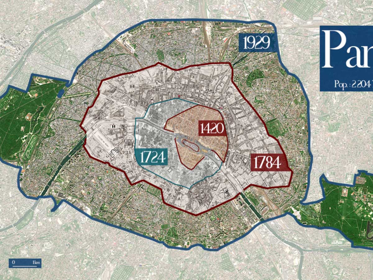
These days, Paris is a massive metropolis of Europe. With a population of over two million and a size of 105 square kilometers (40 square miles), it's the biggest city in the country of France. However, as this map shows, Paris has not always been as sprawling as it is today.
The Paris of 1420 looks downright tiny when compared to how big the city is now. However, the most shocking thing about this map is how much size the city has taken on since 1929. At this pace, Paris will overtake France entirely at some point!
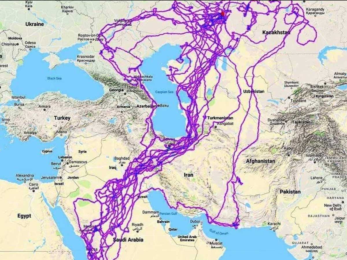
Okay sure, this may not be a map of massive historical importance, but it's definitely one that illustrates a very interesting change over time. This map tracks the movements of a bald eagle over twenty years. And all we can say is that this eagle is more well travelled than some people!
The flight patterns of this bird are just staggering. It made appearances in Africa, the Middle East, and Europe, and it covered hundreds of miles in the process. It just goes to show you that all you need is a pair of wings to see the world.
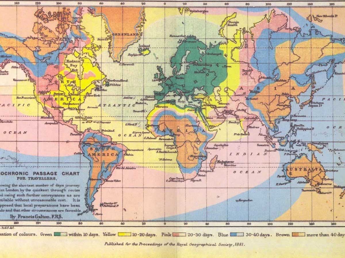
In the modern era, there's nothing worse than flying. It's a cramped, expensive, time-consuming affair. However, when you compare that to the travel times we see on this map from 1881, flying a commercial airline seems like a miraculous luxury. Back then, you had to really ask yourself if going to London was worth the hassle.
If you're in Europe, the trip would obviously be the easiest. However, even then, it could take up to ten days. It's not exactly fast travel. But God help you if you're from Australia and need to make a visit to London--at best, it's going to take you 40+ days!
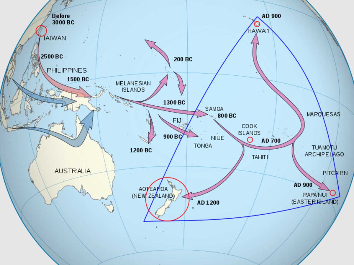
These days, moving around the world is easier than ever. It might be expensive and it might be a grueling trip, but if you really wanted to, you could make it to the other side of the globe in a matter of hours--not days or weeks. However, thousands of years ago, being a jet setter was a much more arduous task.
This map shows the migration patterns of ancient Polynesian people who would go on to be the ancestors of the modern-day Maori people. There are a couple of striking things about this map. One, it appears that these people traveled all the way from modern-day Taiwan, and two, you can see the first arrival of people to New Zealand in 1200 AD.
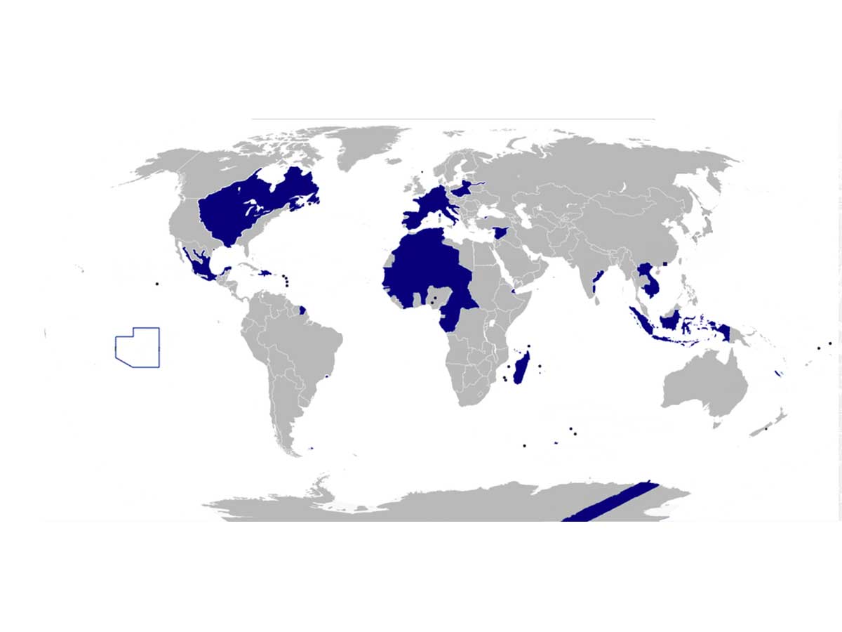
Roughly 3 million people outside of France are under French governance. That's quite a bit, but that's a fraction when compared to the territories the country controlled at the height of their powers. And this map illustrates all the territories that France has historically owned.
Clearly, two of the biggest changes to modern French control took place in Africa and the United States. Also, we're not sure how Antarctica works, but it looks like the French government still has a little sliver of land down there to this day.

During the Cold War, Americans acutely felt the threat of communism. While some of those fears were distorted, there's no denying that communism was a major world power at the time, as this map from 1978 shows. It illustrates all the countries that were implementing some form of communism or socialism at the time.
The biggest change from the time of this map to the modern day is obviously the fall of the USSR. However, there are still five truly communist countries in existence in contemporary times. These include China, Vietnam, Laos, Cuba, and North Korea (depending on who you ask).

It might look like modern-day Louisiana, but this is actually a map of the Orleans territory, which was in existence for only a few short years, from 1804 until 1812. At that point, it was admitted to the Union as Louisiana. As you can see, some areas were in dispute by Spain and Florida.
Louisiana residents should notice another interesting change between this old map and the modern-day state. If you look closely, you'll see that the Orleans territory was divided up into counties. However, Louisiana is currently divided up into parishes--making it only one of two states that don't use the "county" designation.
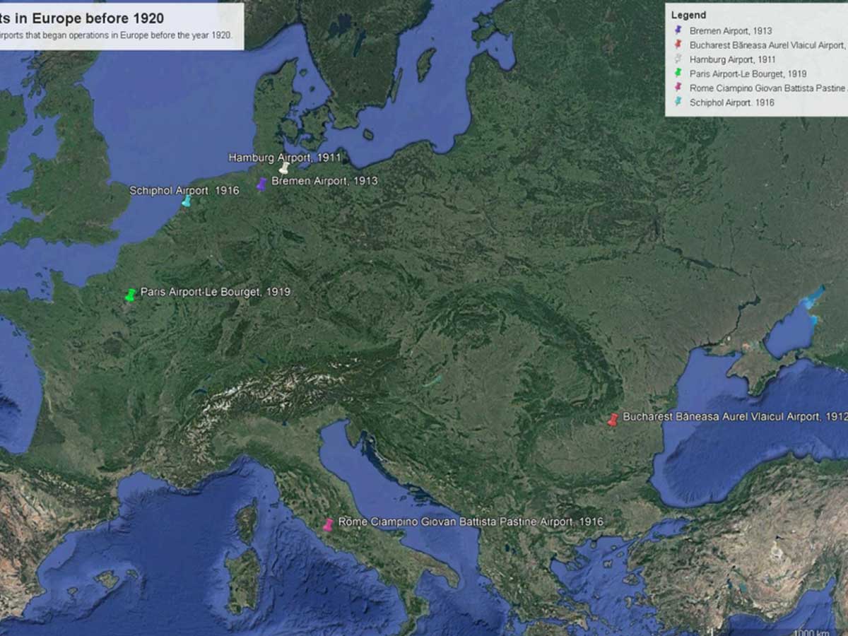
For those of us who hate the airport, this map of Europe should look absolutely lovely. It shows the airports (or lack thereof) on the continent before 1920. Considering that commercial air flights had only begun in 1914, it's no wonder that there weren't many airports to choose from back then.
These days, it's a completely different story when it comes to airports in Europe. Today, there are a staggering 1000+ plus airports across the continent. However, there are a few hold out countries that still don't have their own. They include Andorra, Liechtenstein, Monaco, San Marino, and Vatican City.
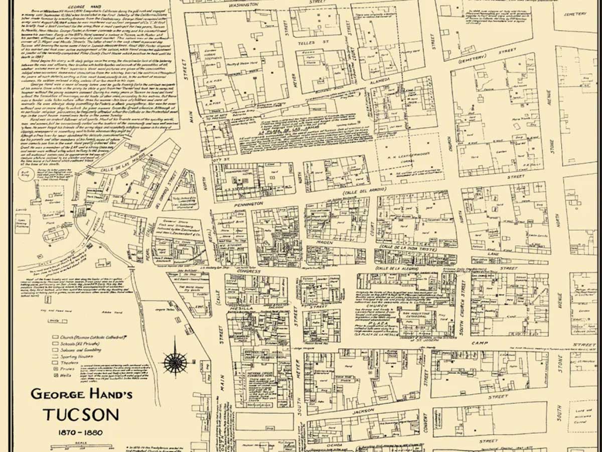
Unless you're a Tucson native, this map probably doesn't seem to interesting at first glance. The town has probably expanded beyond these borders at this point, but it's just a normal, old map, right? This map is actually hiding a little secret, though!
An eagle-eyed commenter on Reddit noticed that, if you zoom in enough, you can actually see an opium den listed on the map! That's definitely something that's changed since way back then--Tucson now has a conspicuous lack of opium dens and maps that show you where they are.
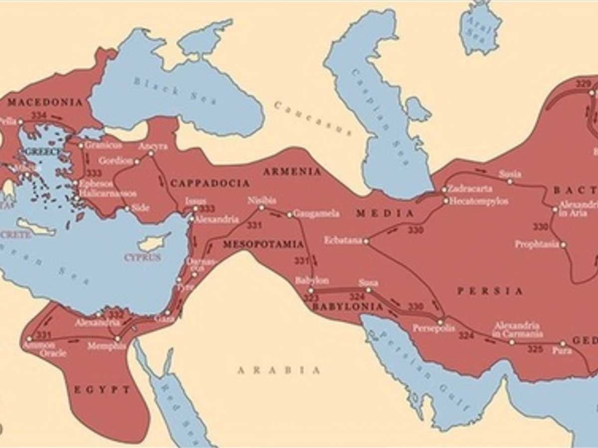
There's never been a conqueror quite like Alexander the Great. At the peak of his powers, his Macedonian empire had more than 5 million inhabitants and covered more than 2 million miles. If it were still a modern-day nation, the area it covers would be larger than India.
However, like all empires, Macedonia fell from power as other empires rose to take its place. It does still exist in the modern day, though. It is an administrative region in northern Greece with a population of roughly 2.5 million people.
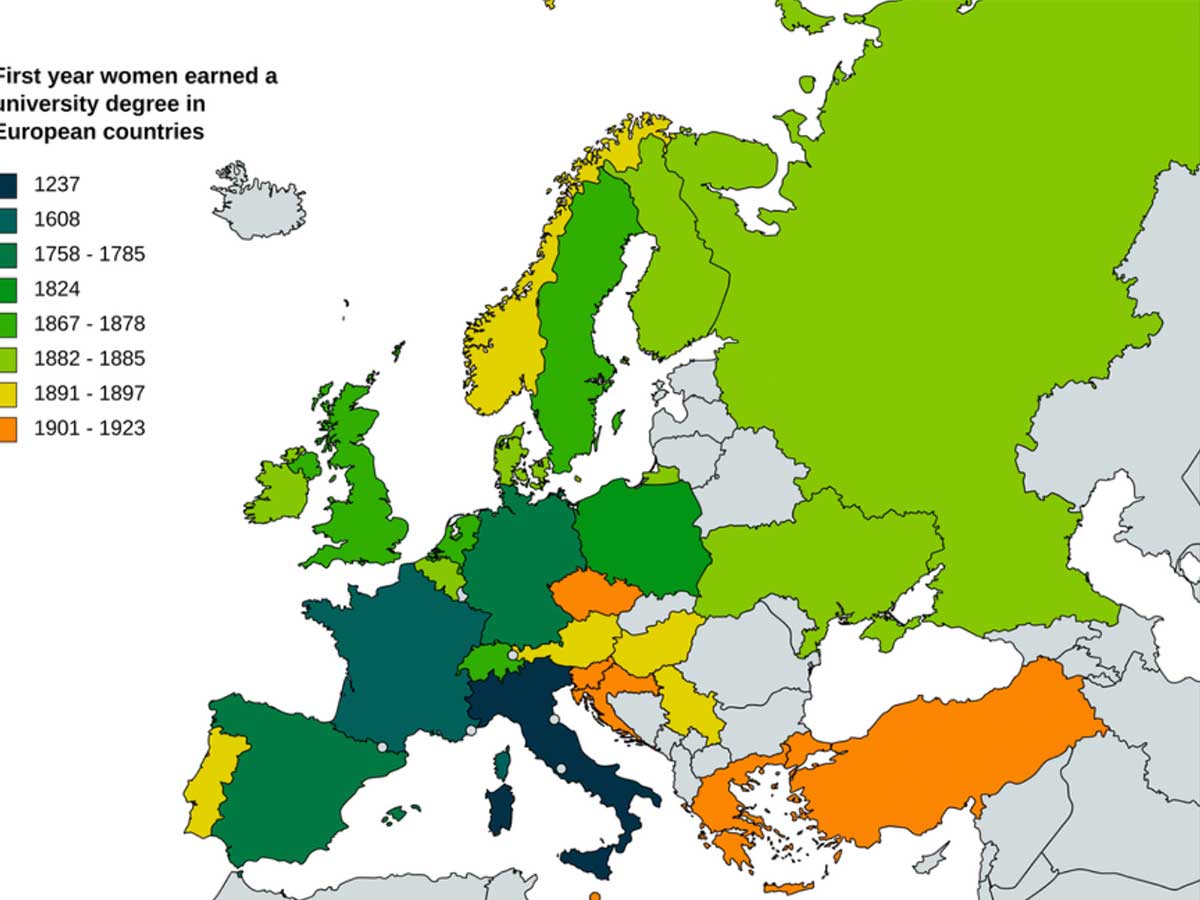
These days, women make up a majority of the college population. However, that wasn't always in the case. For centuries, they were prevented from formal studies, but that began to change in Europe, but it did happen very slowly, as this map tracking their progress indicates.
As you can see, Italy was the first grant a degree to a woman all the way back in 1237. But the rest of Europe would take centuries to catch up with Italy's lead. For some countries, women didn't earn any degrees until well into the 20th century.